The Elements
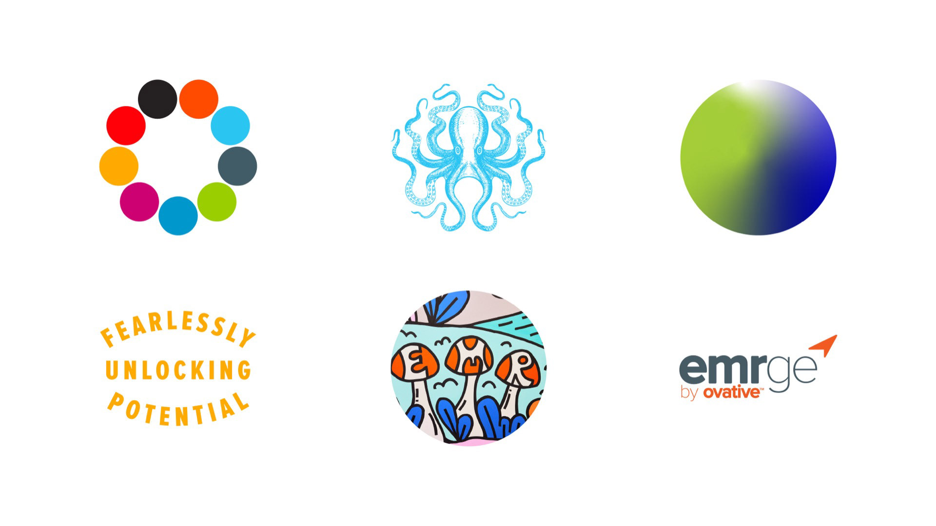
We reserved the signature octopus mark for the cover and key section dividers, allowing it to serve as a distinctive brand moment without becoming overused. The template system was designed with flexibility in mind, enabling users to easily swap imagery when a more expressive or personality-driven approach is needed — while still maintaining overall brand consistency.


Leveraging the existing brand elements, the design system creates clear sectional cues that signal exactly where users are within the narrative. This structure not only simplifies content creation for internal teams but also makes the presentation intuitive and easy to navigate for the audience.


Assigning a dedicated gradient system for case studies created a clear visual cue for marketers, making it easy to differentiate content while maintaining brand consistency. This approach streamlined production and reinforced a cohesive storytelling framework across materials.

emrge Sub-Template
EMRGE is built around connecting marketing investment directly to measurable business outcomes. With six distinct sub-brands under the umbrella, the challenge was to simplify the system — reducing complexity while clearly defining the visual elements available for use. I developed a flexible sub-template structure that maintained consistency across the master brand while giving each sub-brand space to be expressed clearly and cohesively.

Impact
The PowerPoint templates transformed presentations from one-off decks into a cohesive brand experience. By introducing a structured layout system, refined typography, and flexible content modules, the template empowered teams to build polished, on-brand presentations quickly and confidently. It reduced production time, improved visual consistency across departments, and elevated how the company shows up in client meetings, pitches, and internal communications — reinforcing credibility at every touchpoint.