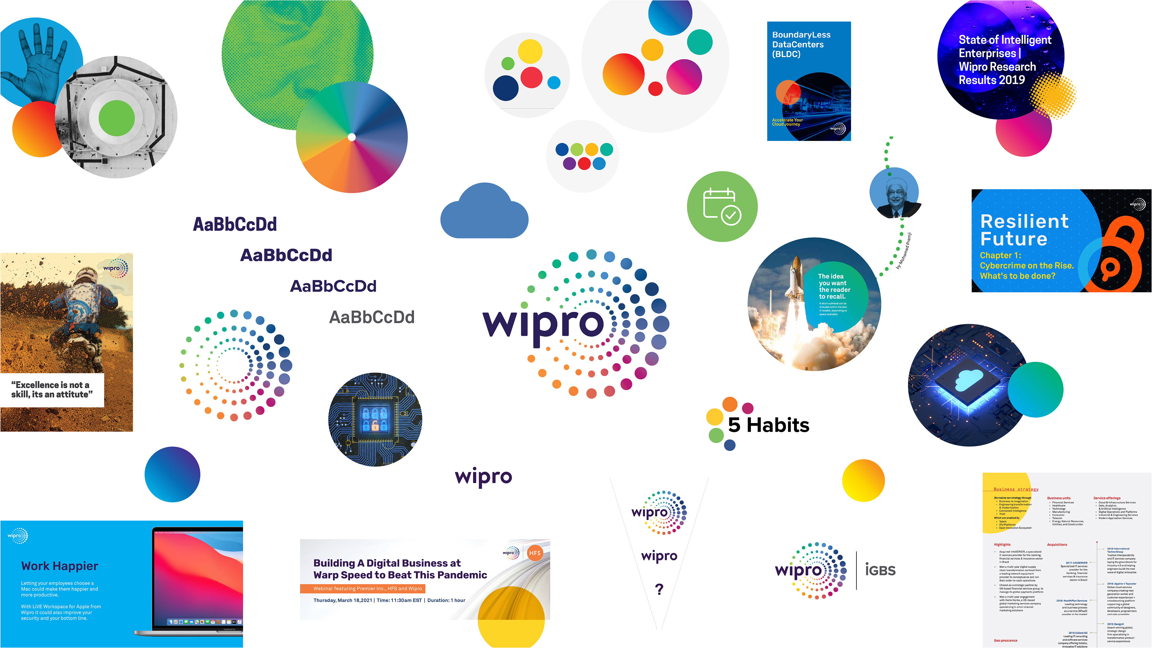
The Challenge
– Legacy brand elements lacked cohesion and scalability
– Inconsistencies across logo usage, color, typography, and imagery
– Difficulty maintaining brand integrity across regions and channels
– Inconsistencies across logo usage, color, typography, and imagery
– Difficulty maintaining brand integrity across regions and channels
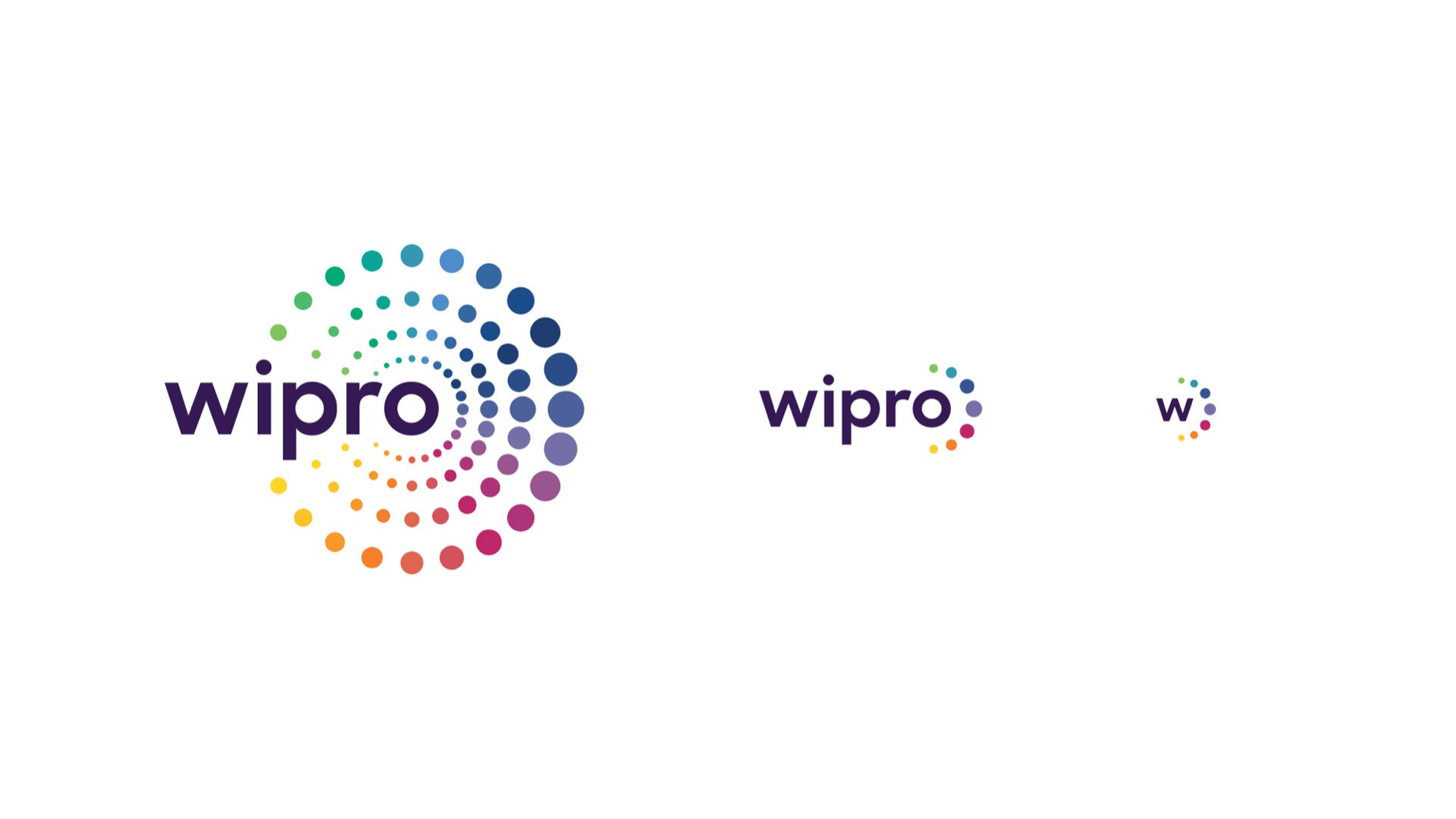
Logo Construction
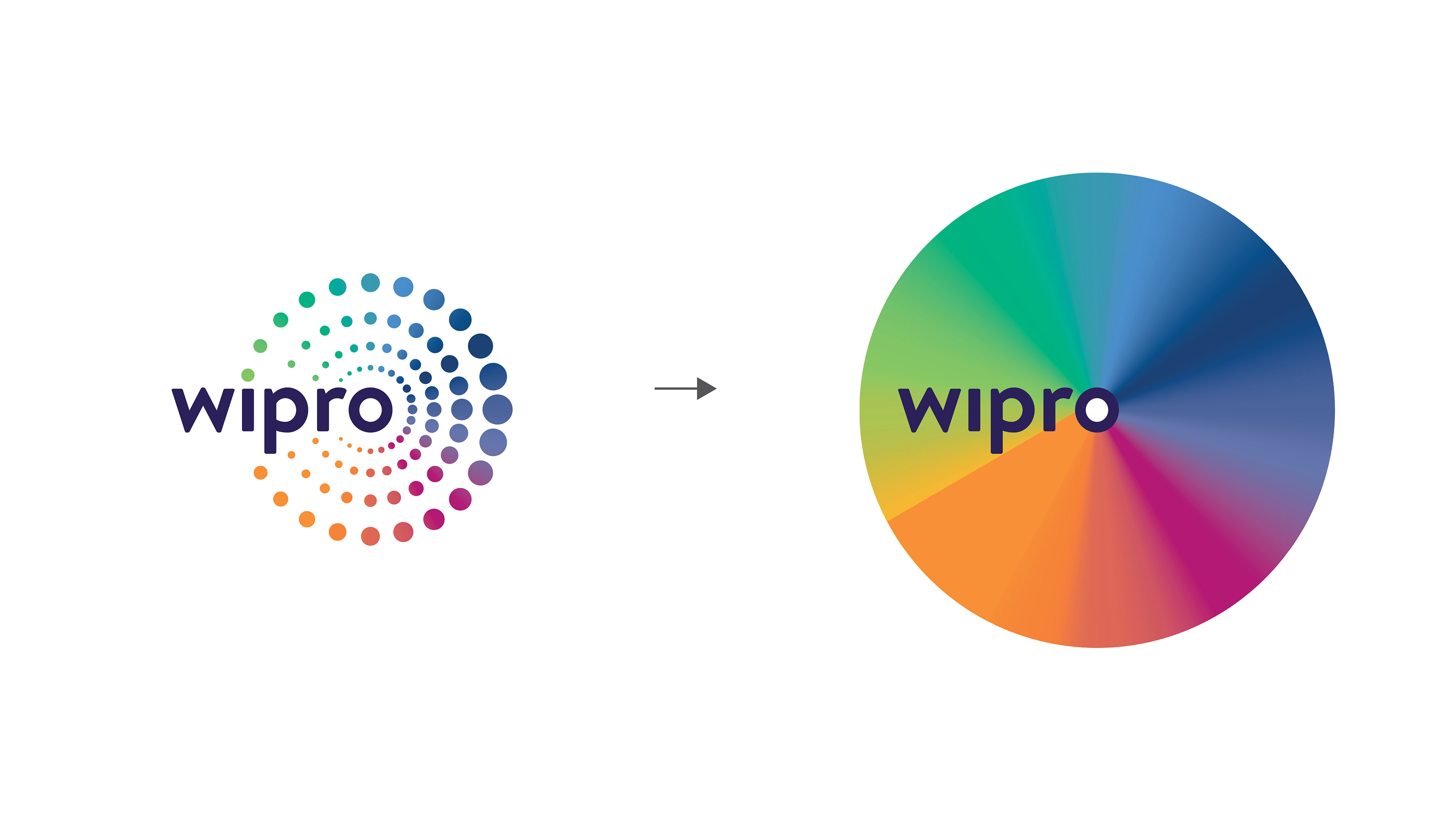
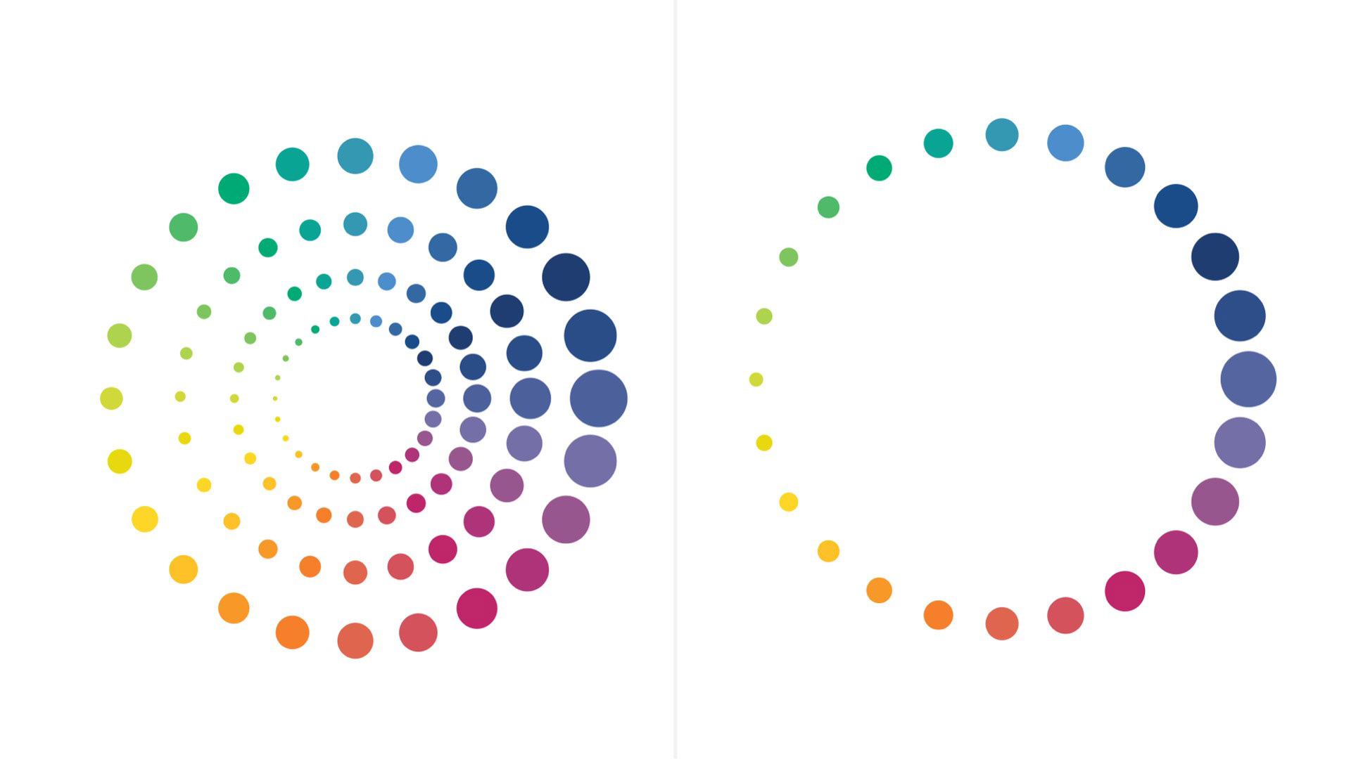
The gradient sublayer created reproduction challenges and blurred the clarity of the brand’s core colors.
The gradient sublayer created reproduction challenges and blurred the clarity of the brand’s core colors.
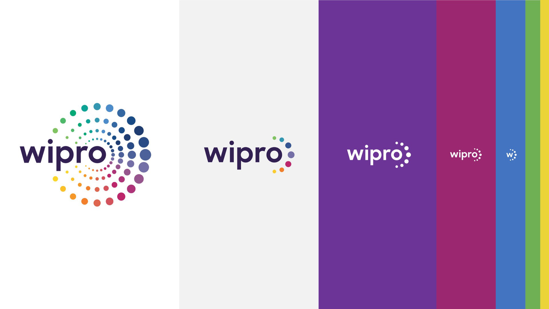
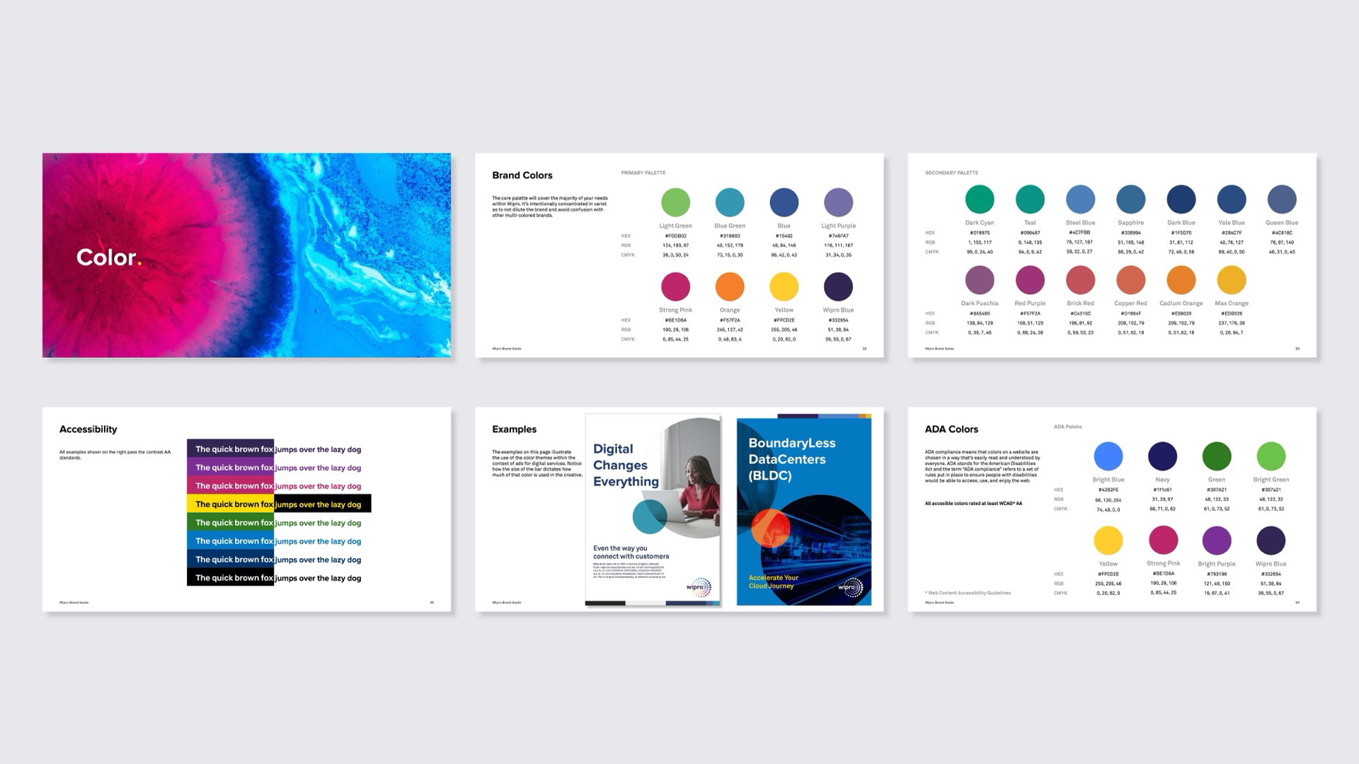
Color Palette Issues
The established color palette did not align with the logomark, despite the mark containing a rich range of color — resulting in missed opportunities for cohesion.
The established color palette did not align with the logomark, despite the mark containing a rich range of color — resulting in missed opportunities for cohesion.
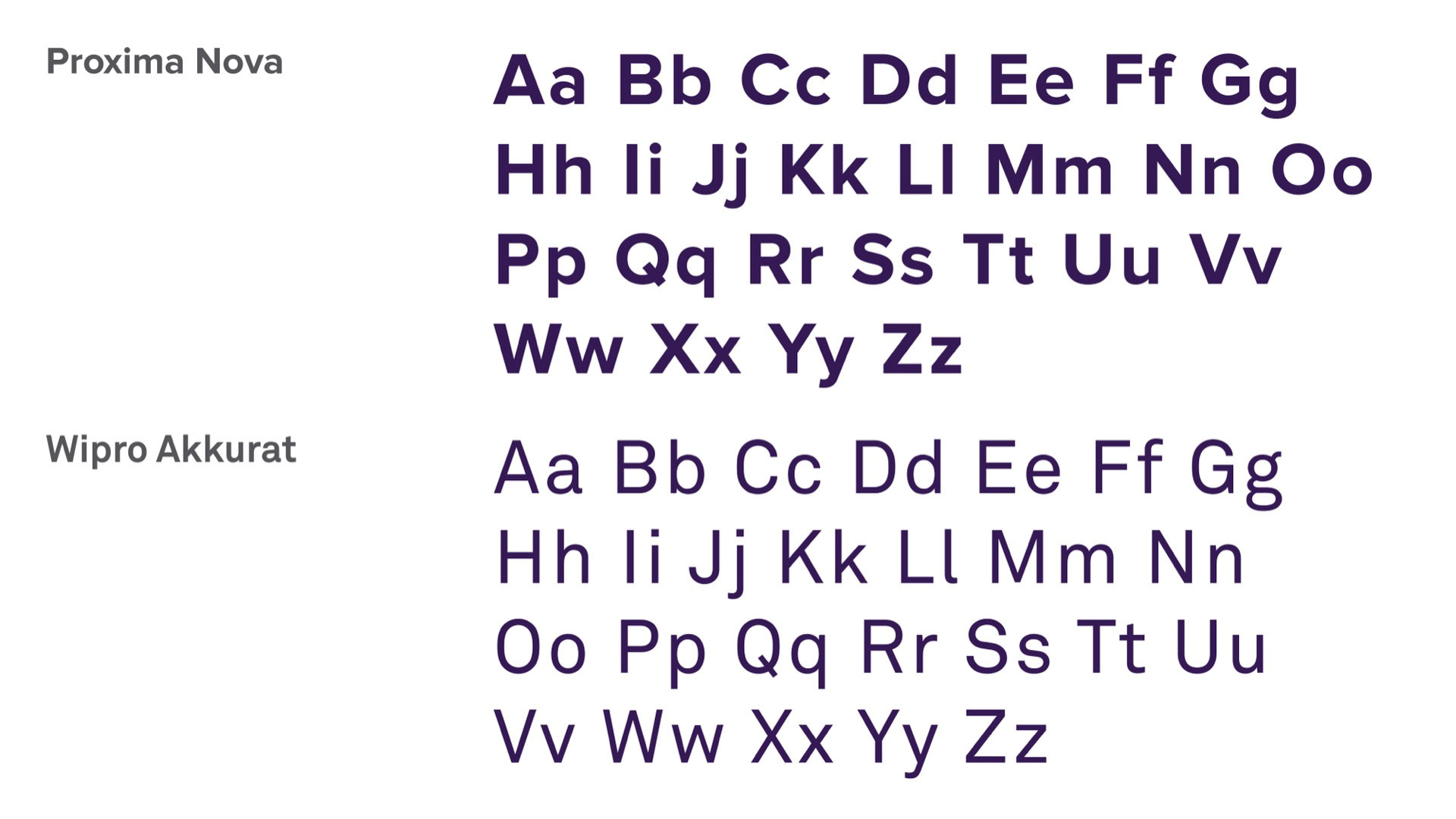
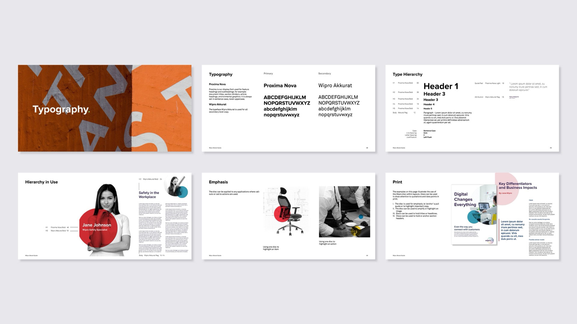
Typography Issues
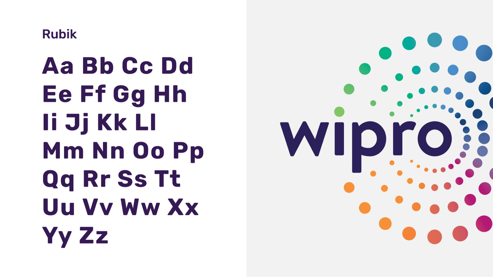
Wipro’s primary typeface felt dated, and Rubik lacked the authority the brand required. This led to a typographic reset built to better reflect Wipro’s positioning and scale across its sub-brands.
Wipro’s primary typeface felt dated, and Rubik lacked the authority the brand required. This led to a typographic reset built to better reflect Wipro’s positioning and scale across its sub-brands.
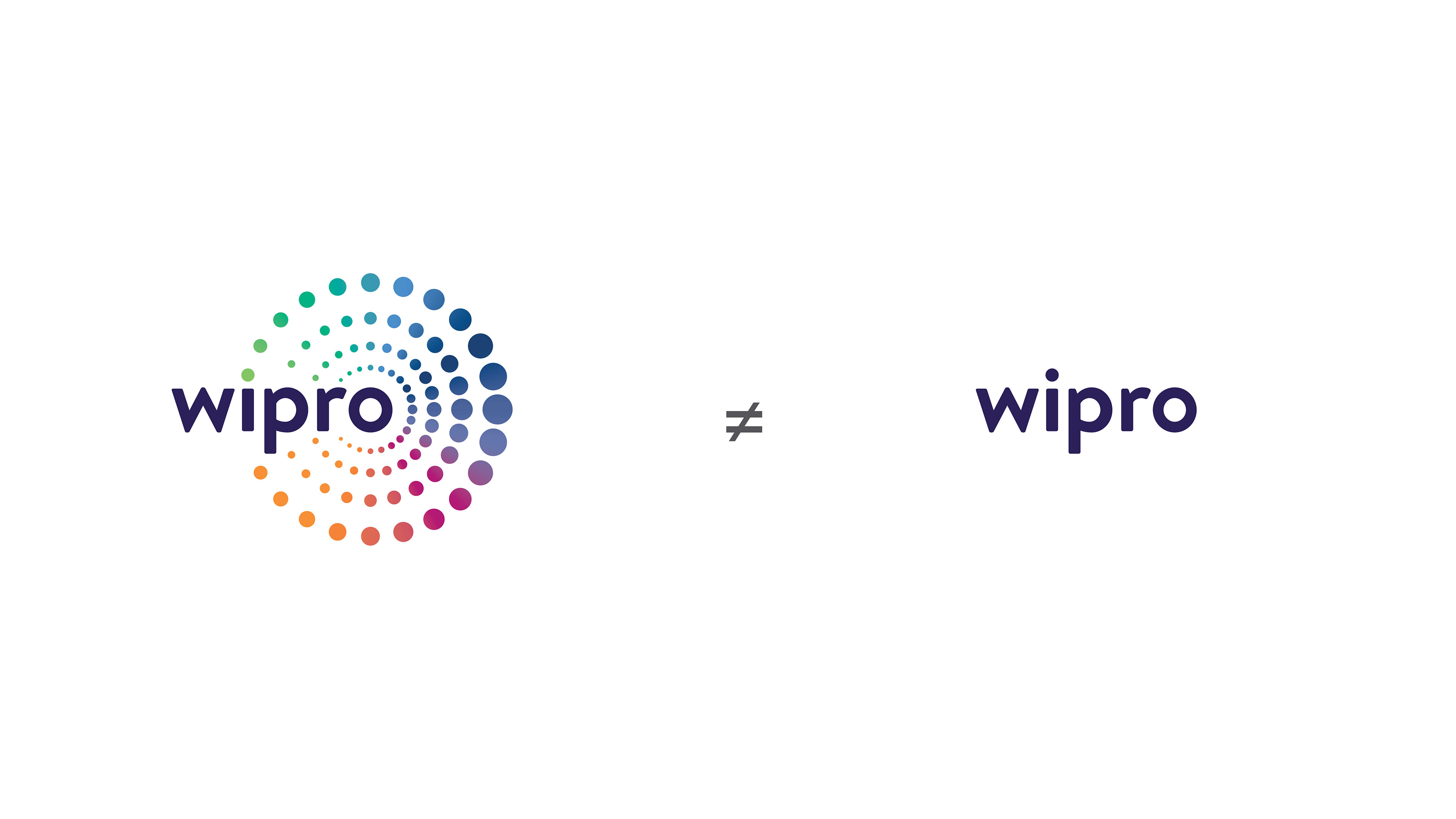
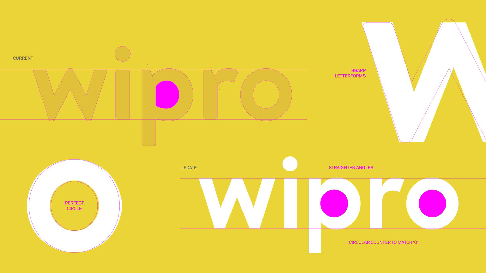
The primary mark and wordmark were not operating as a unified system, resulting in fragmented brand expression.
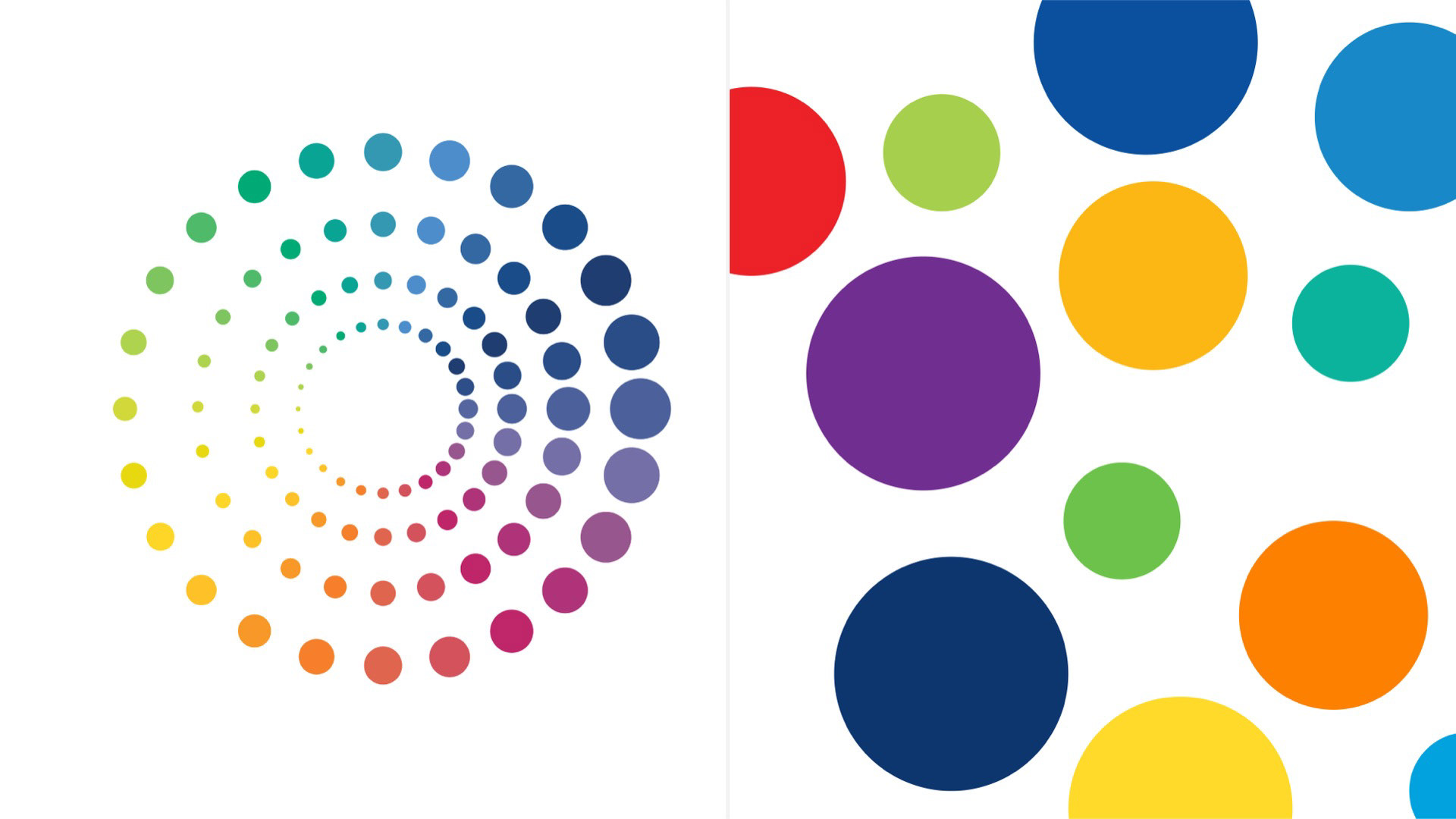
A deeper review of the logo assets revealed that the colored discs were built from a rasterized gradient image, not a scalable system — creating technical and production constraints.


The Tolleson Touch
I helped direct Tolleson Agency to redesign Wipro foundational elements including the logo, color palette, typography, and visual identity. The result was a flexible, unified system designed to scale across mediums and teams.
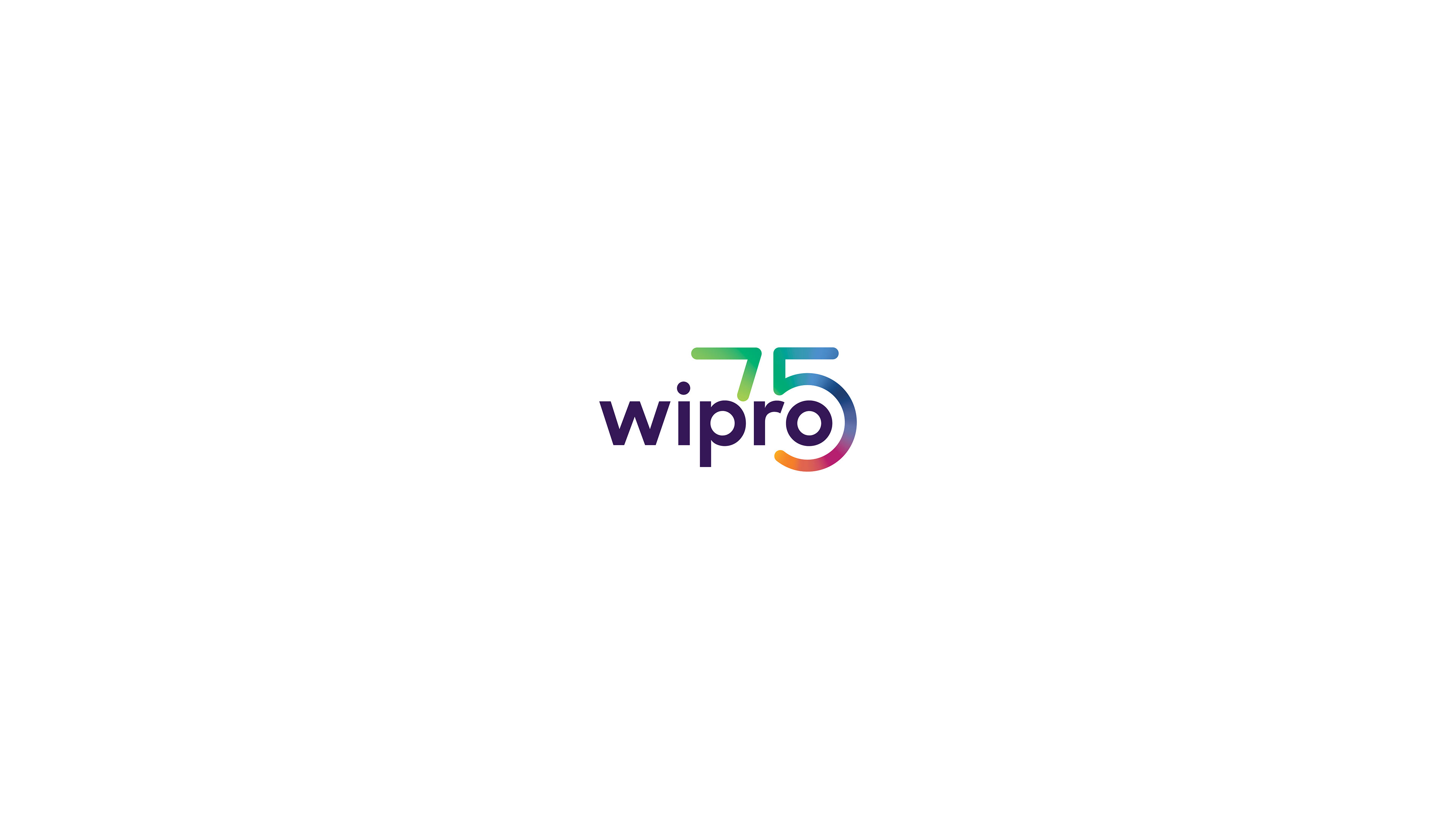
Grounded in a comprehensive redesign of Wipro’s brand guidelines, the work modernized the logo, color palette, typography, and visual identity to create a cohesive, scalable system across 230,000 employees. In partnership with the Tolleson Agency, this reset informed a major website redesign, the 75th Anniversary logo, and the rollout of new global standards — strengthening clarity, consistency, and execution worldwide.

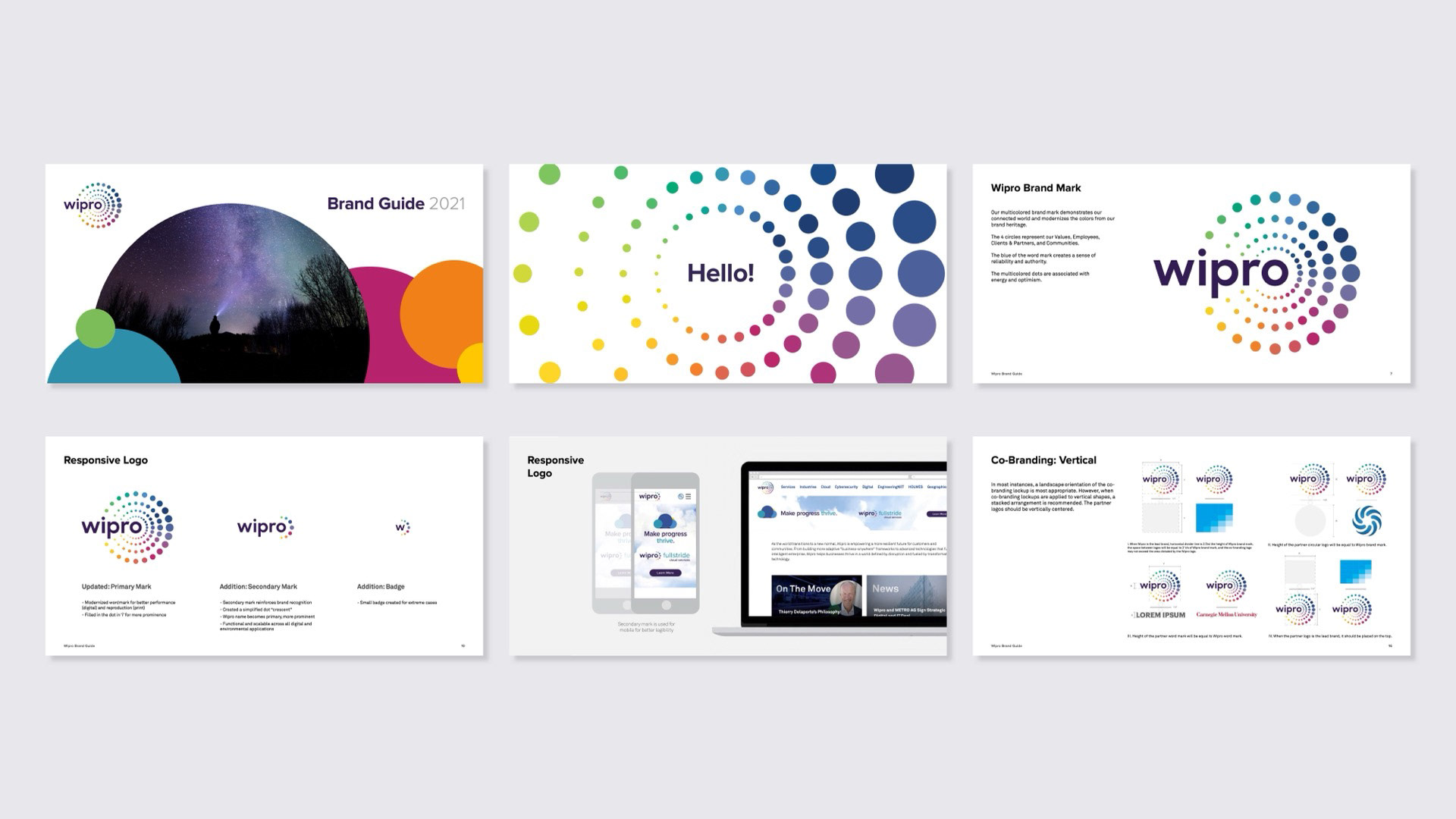
Brand Guidelines
The result was a unified set of global standards designed to scale across teams, platforms, and sub-brands while strengthening consistency and brand clarity worldwide.
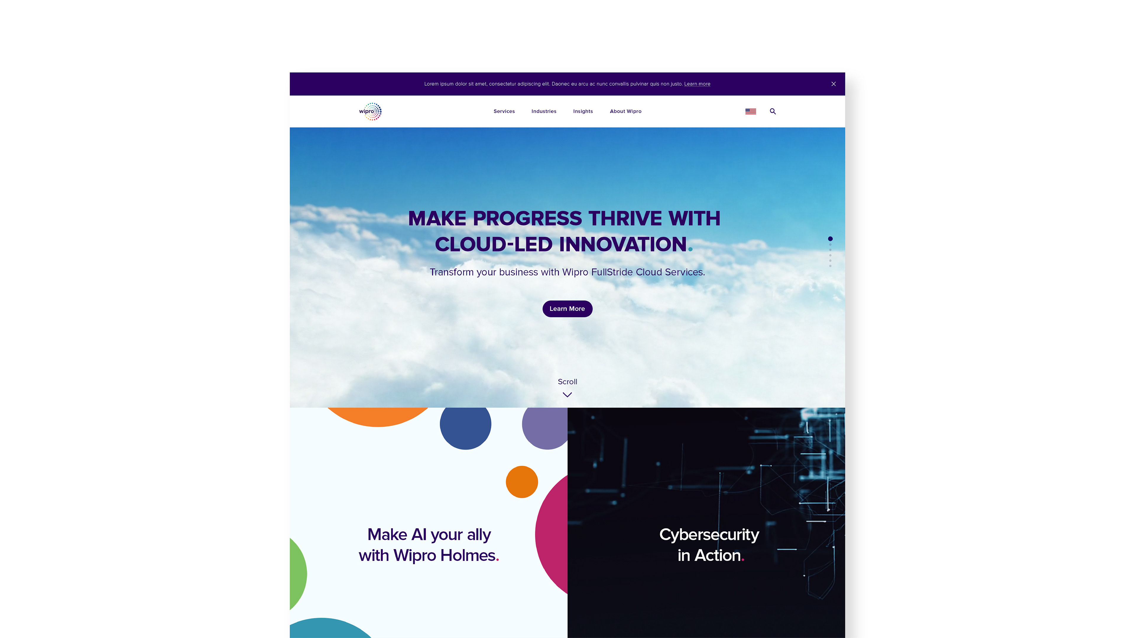
Digital Experience
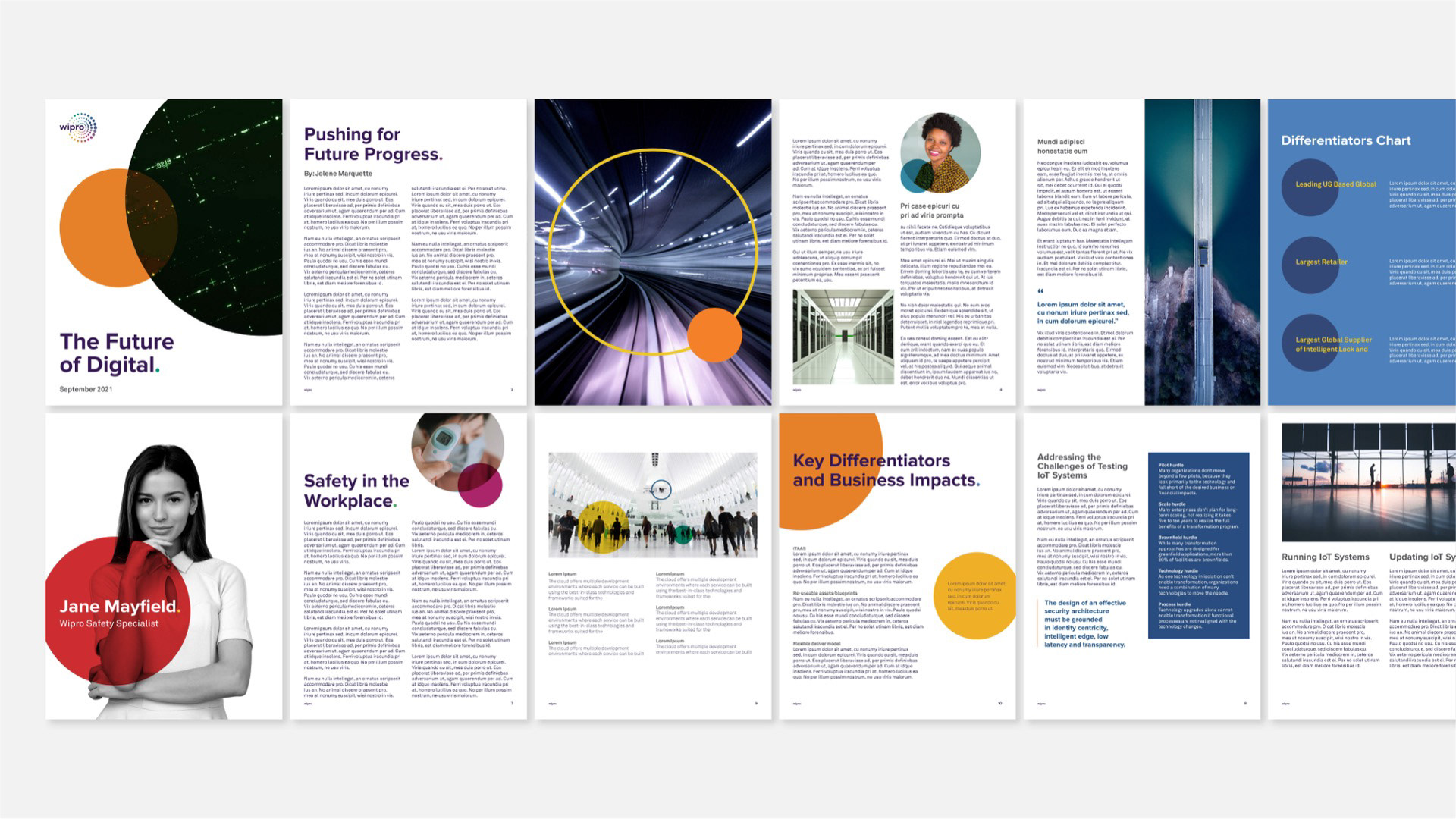
The updated brand system was applied to a major website redesign, defining layouts, components, and visual patterns that balanced clarity, usability, and brand expression across a complex digital ecosystem.
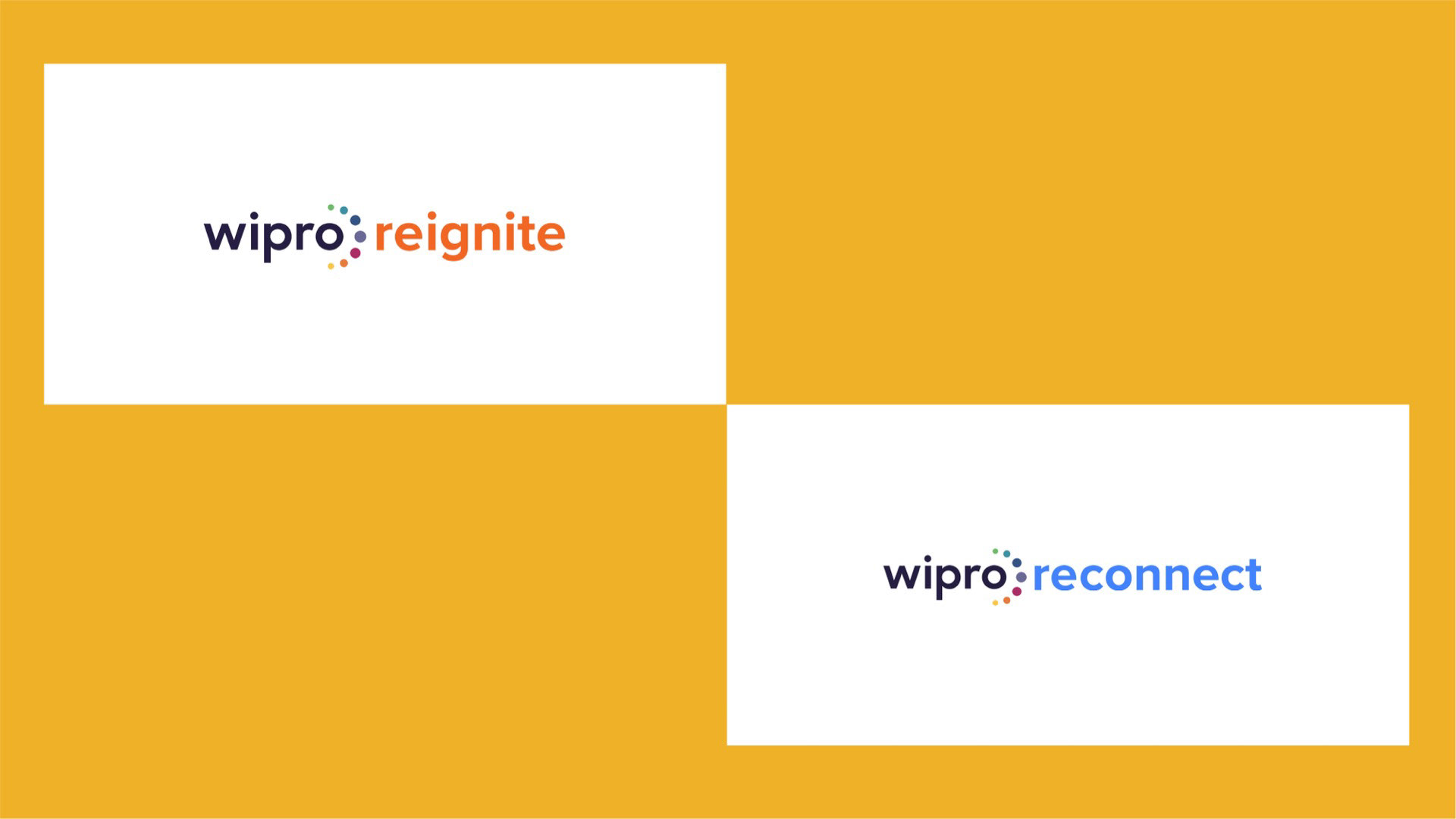
Campaigns & Milestones
Fliers
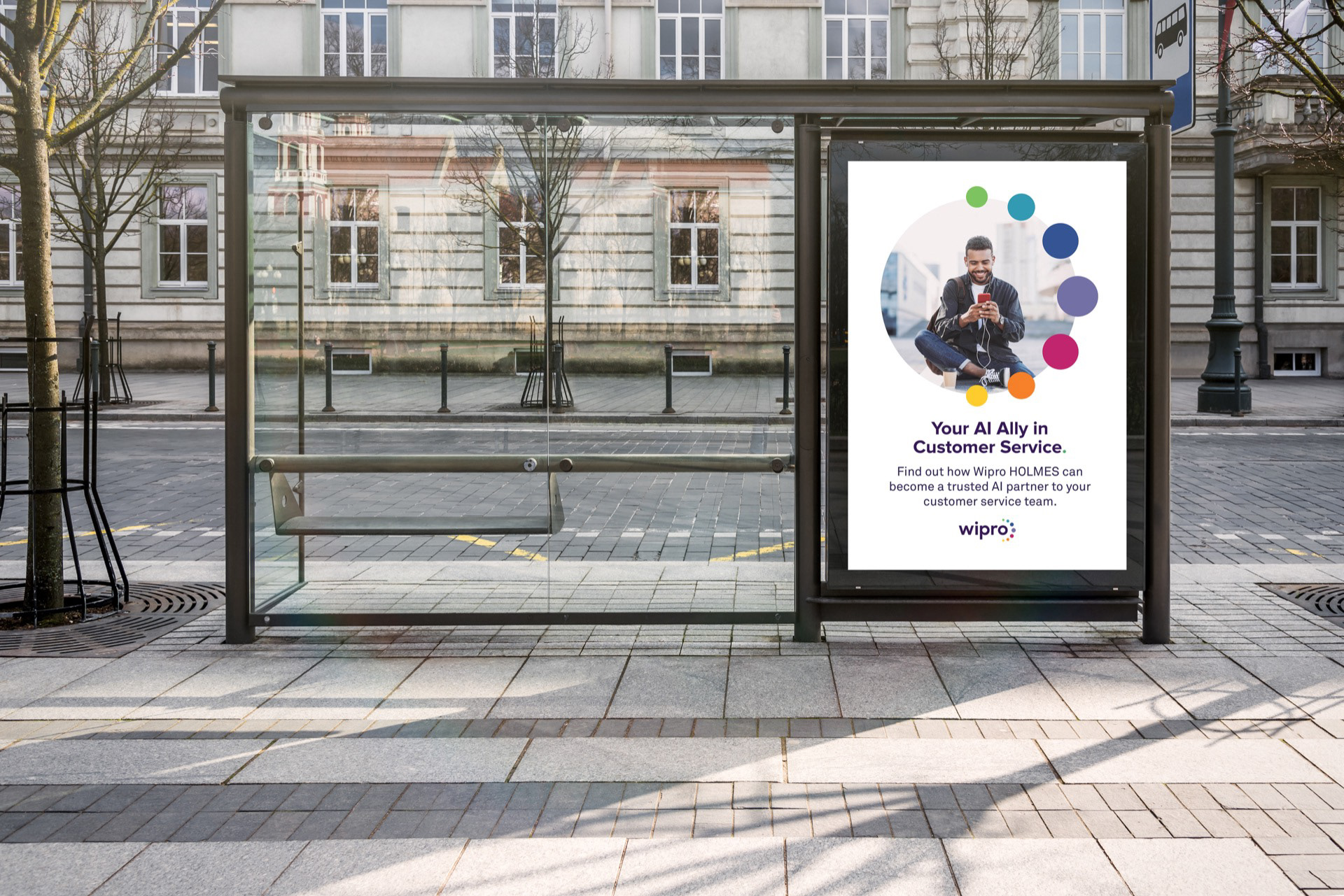
Ad Campaigns
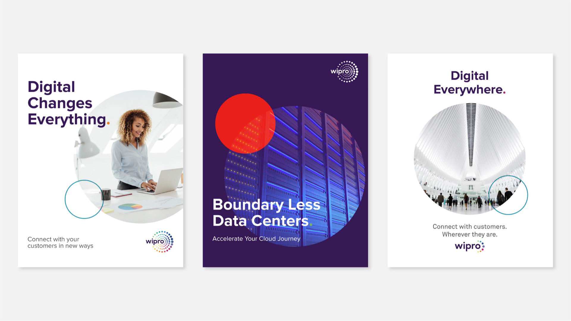
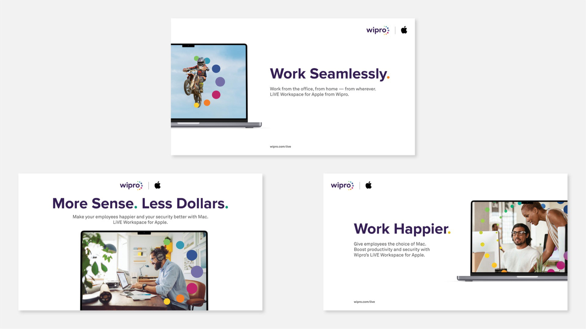
Co-Branded Ads
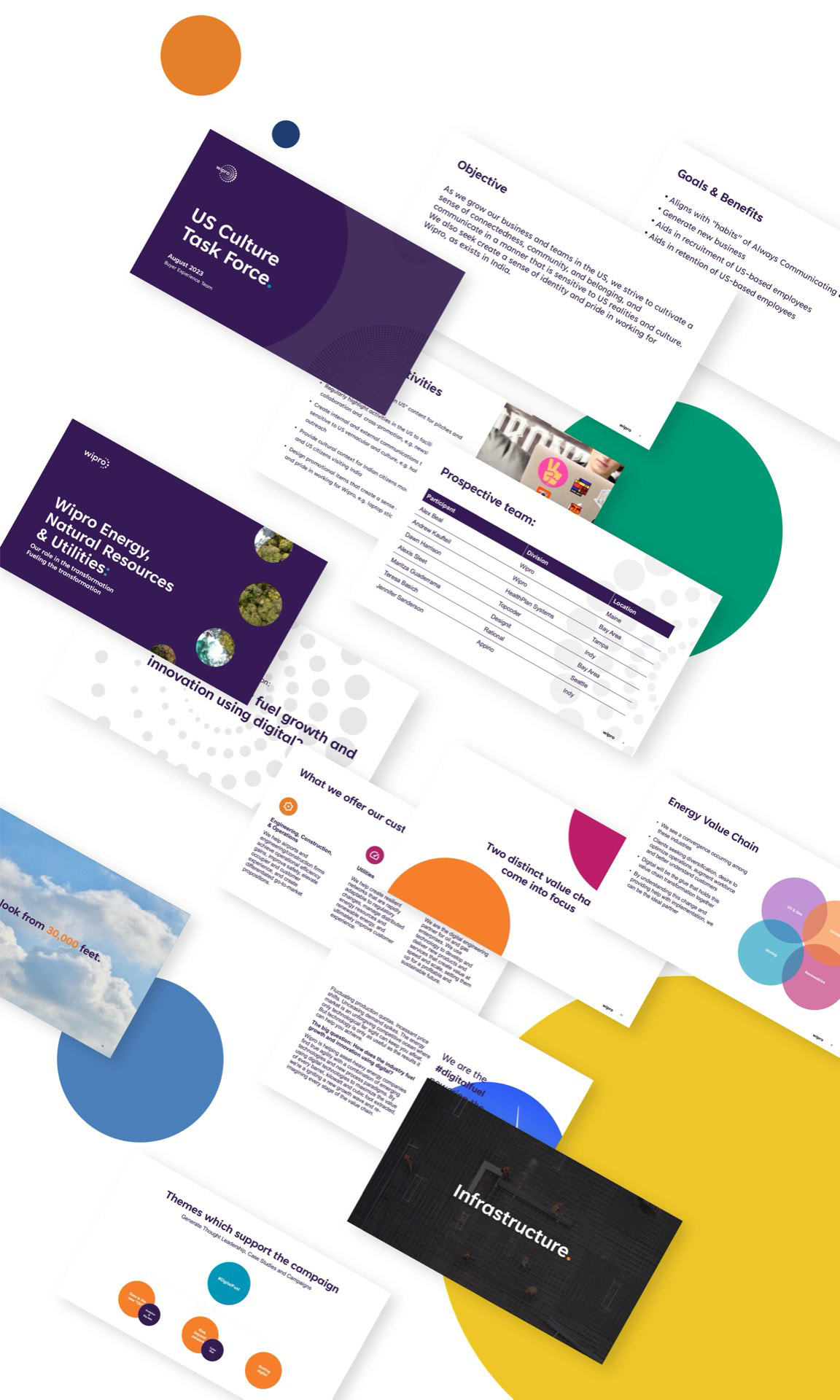
Presentations
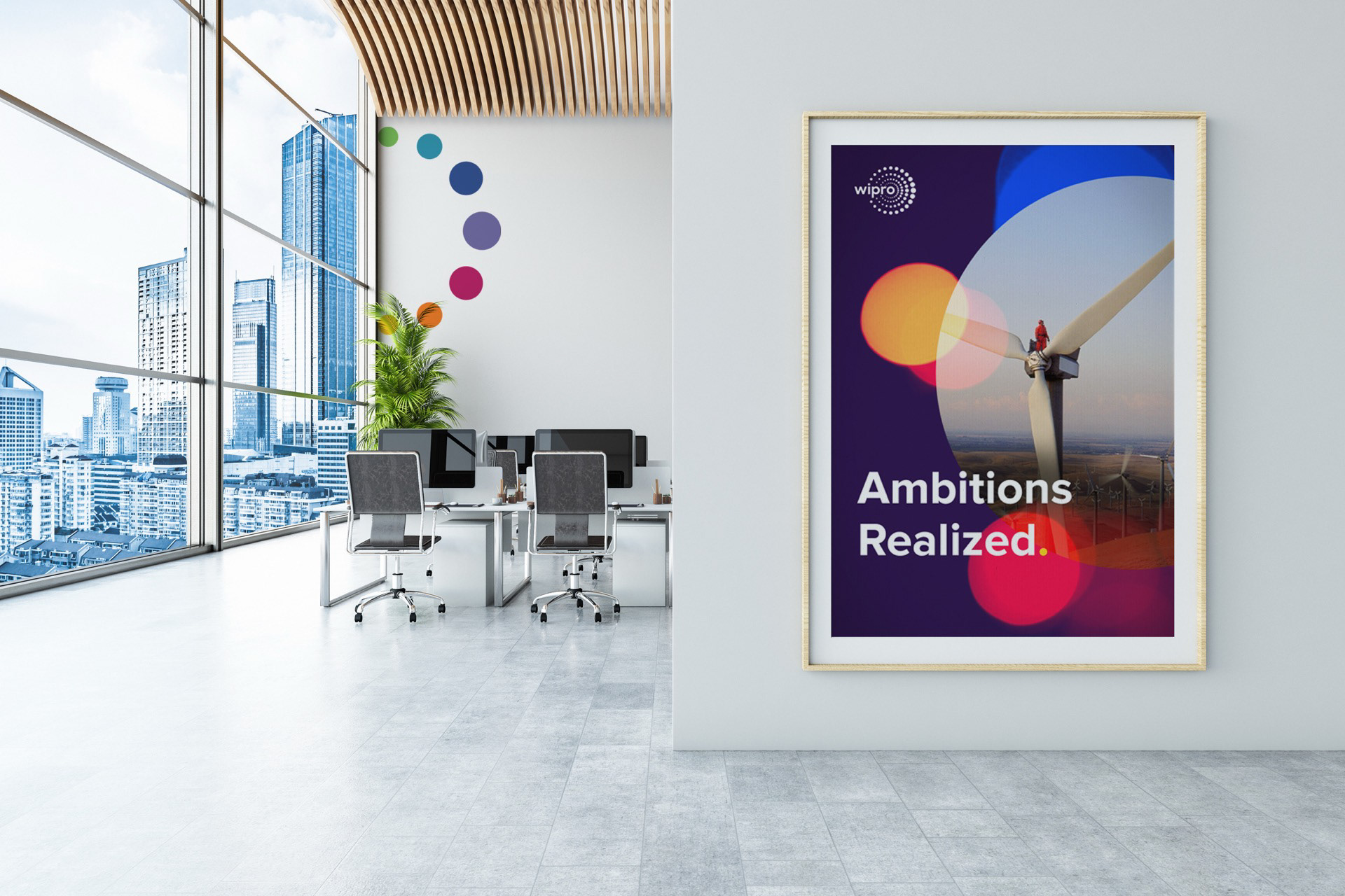
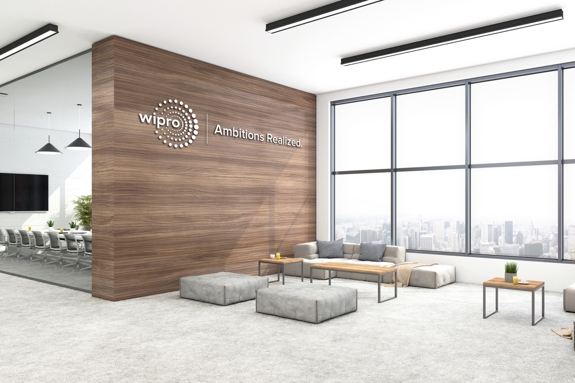
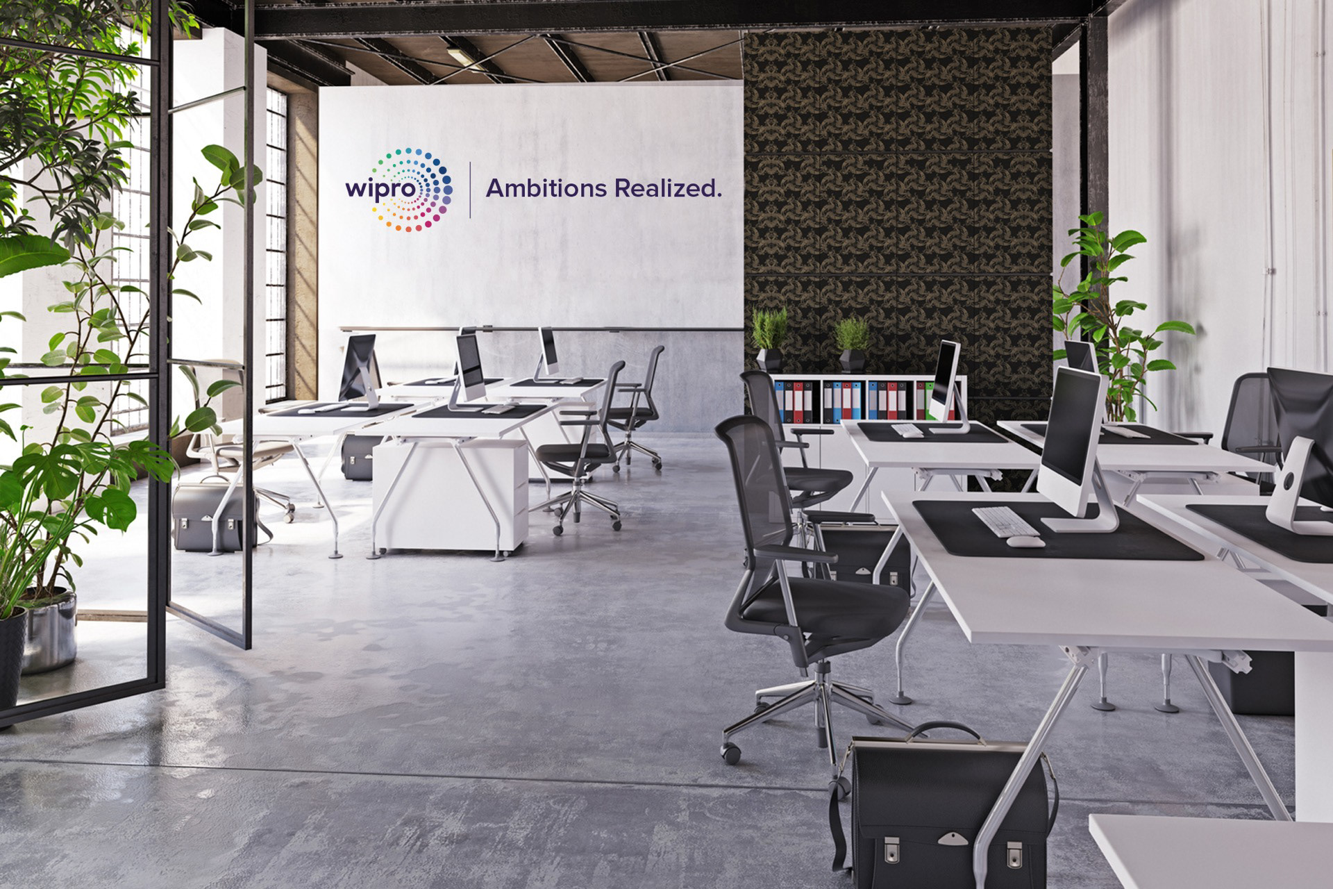
Environmental
Impact
A Brand Built to Scale
The redesigned guidelines and visual system enabled greater consistency, efficiency, and creative alignment across Wipro’s global teams—supporting long-term brand growth and future evolution.
– Brand consistency across 230,000 employees and 60 countries
– Improved scalability and efficiency for marketing, communications and digital
– A durable system that supported future growth