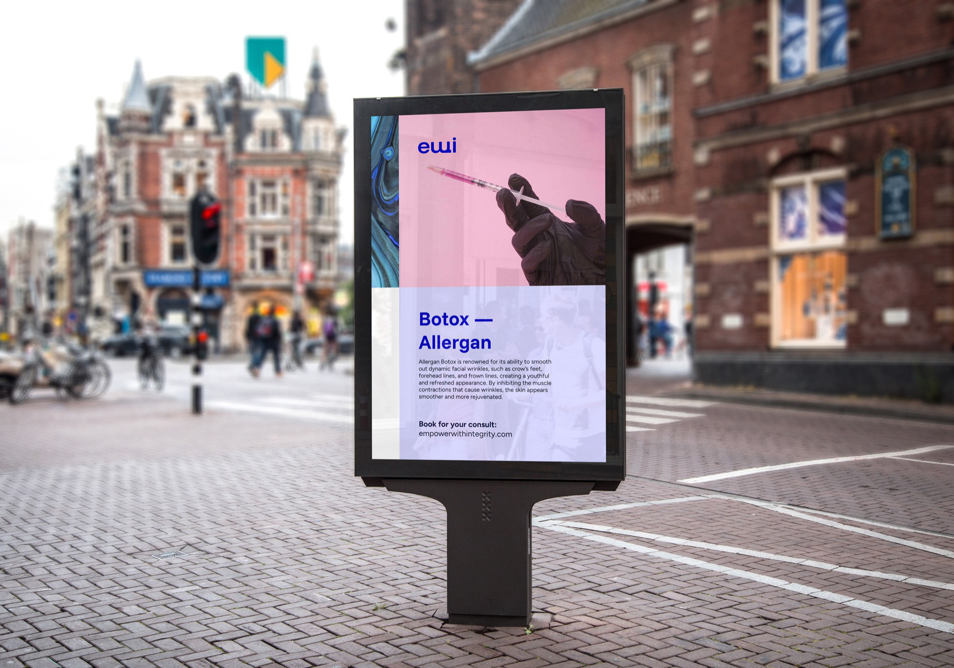
In the end, the identity isn’t about decoration. It’s about confidence. A brand that doesn’t need to shout — because everything around it speaks clearly and with intention.
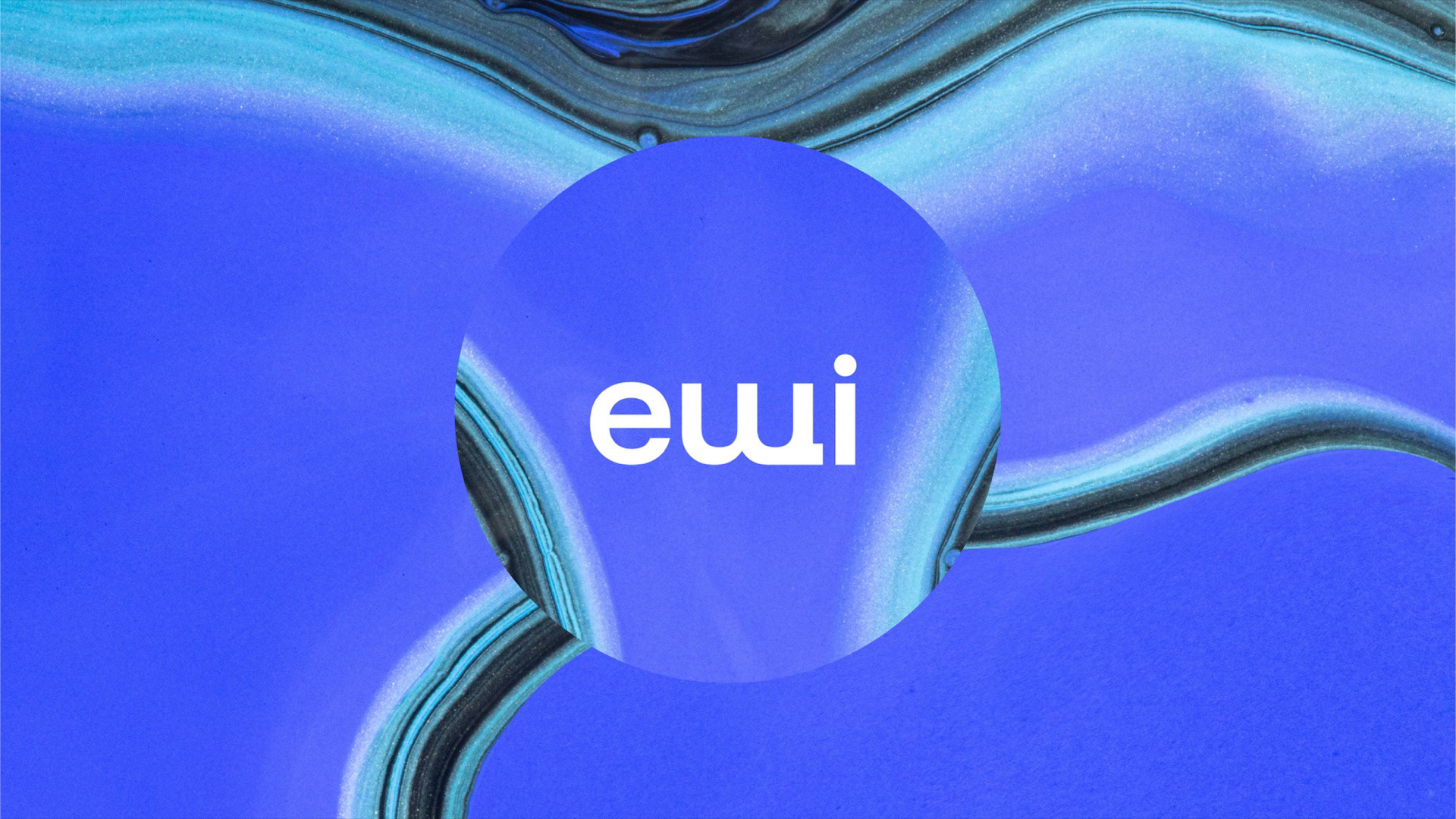
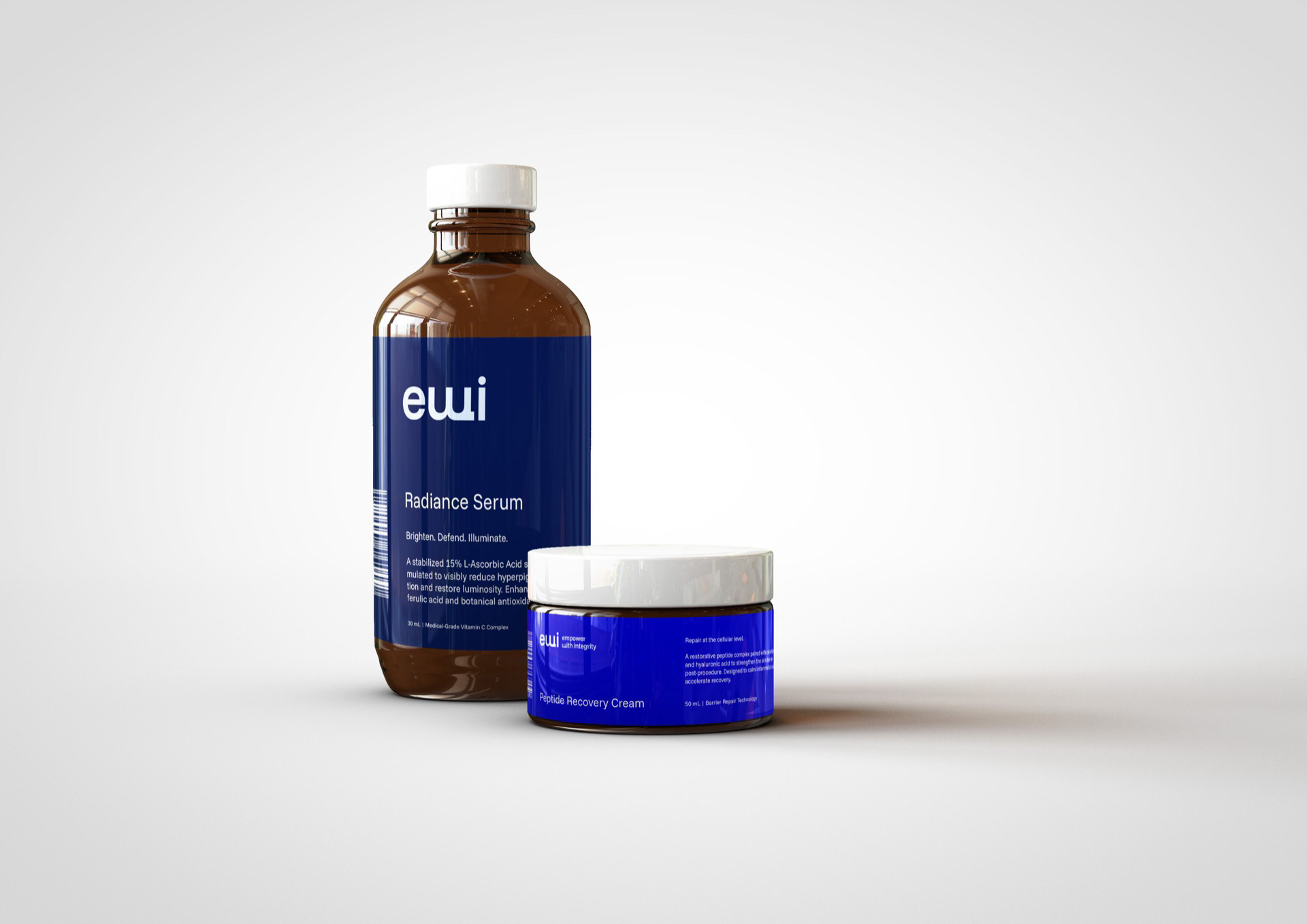
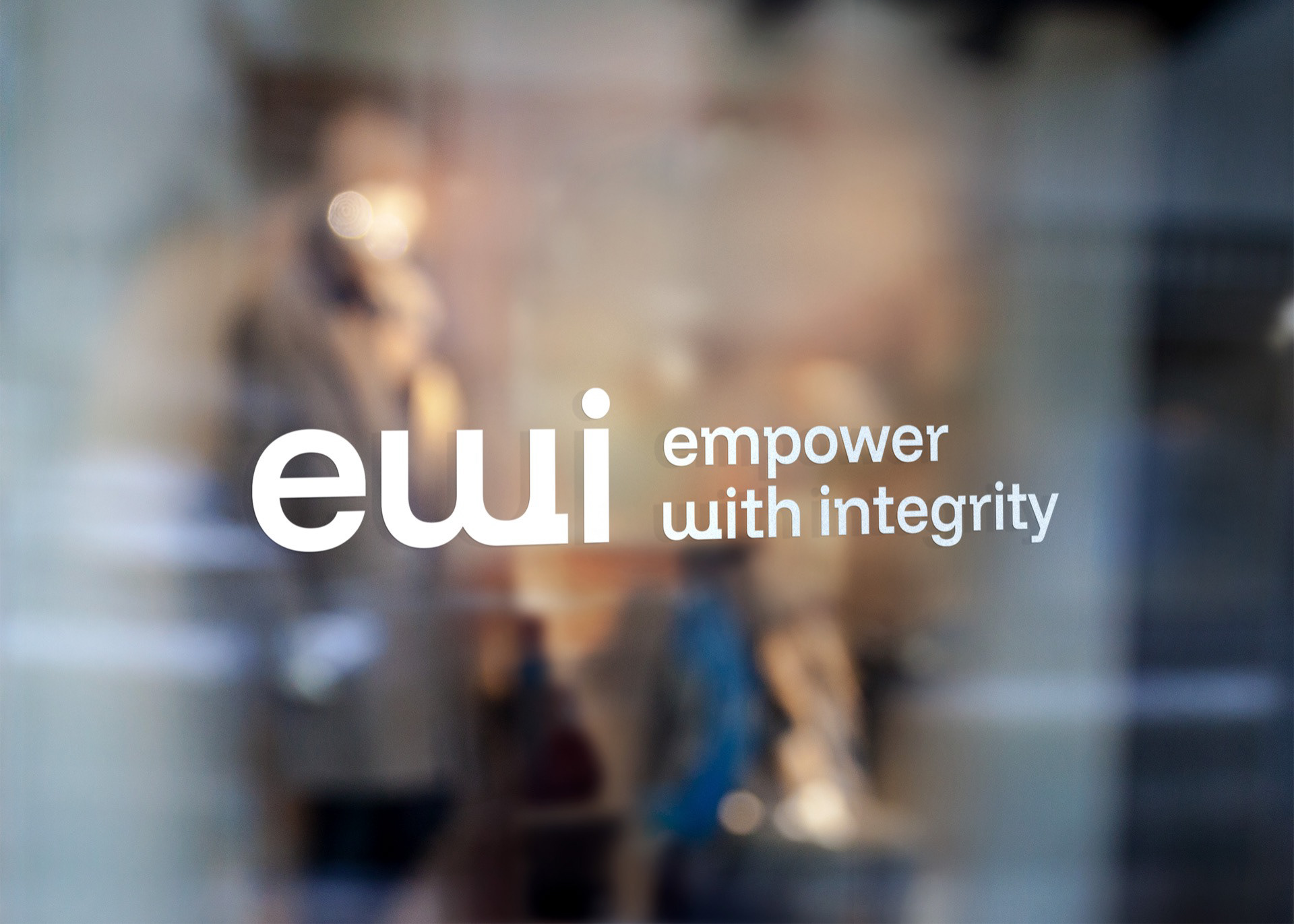
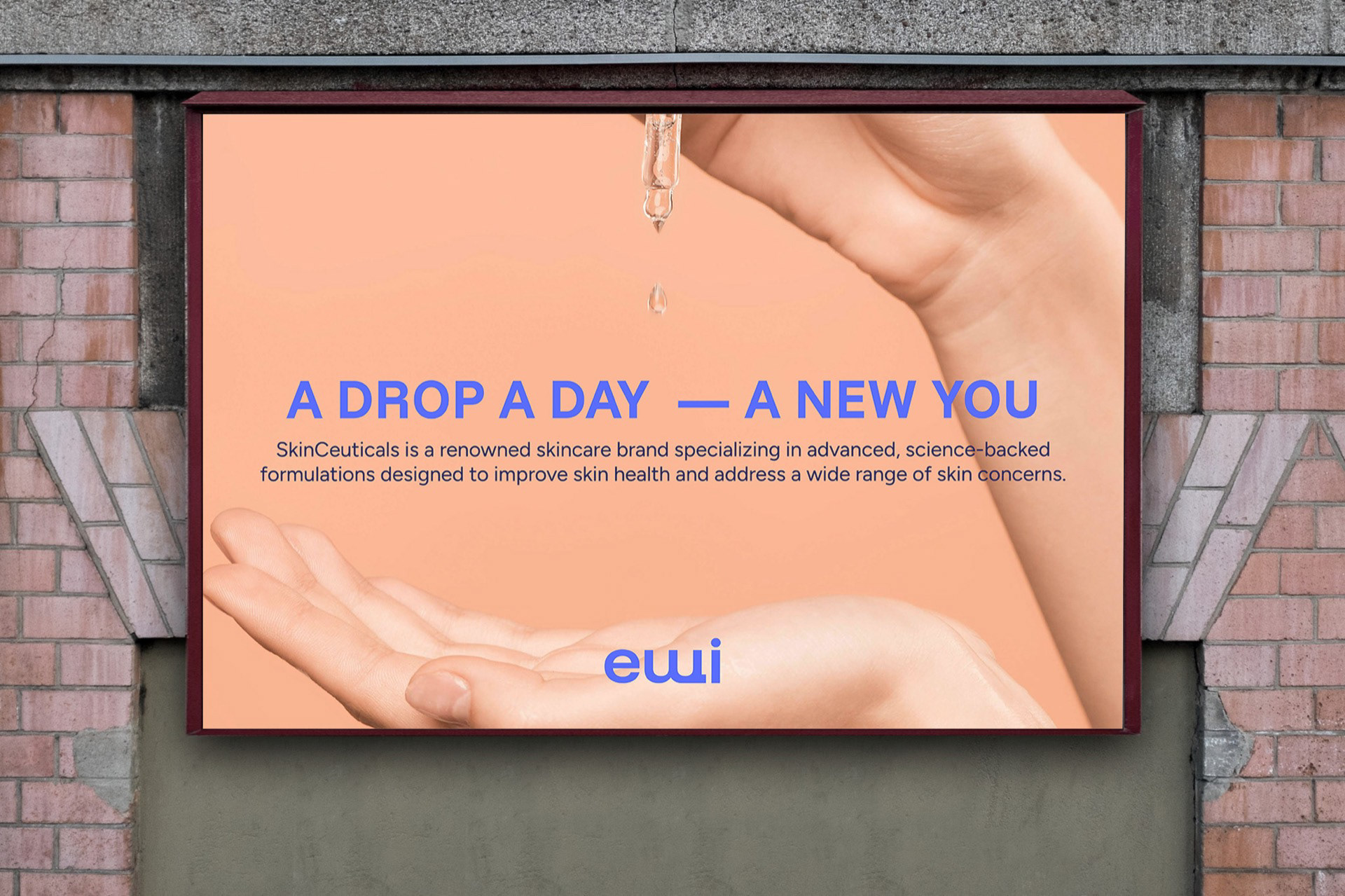
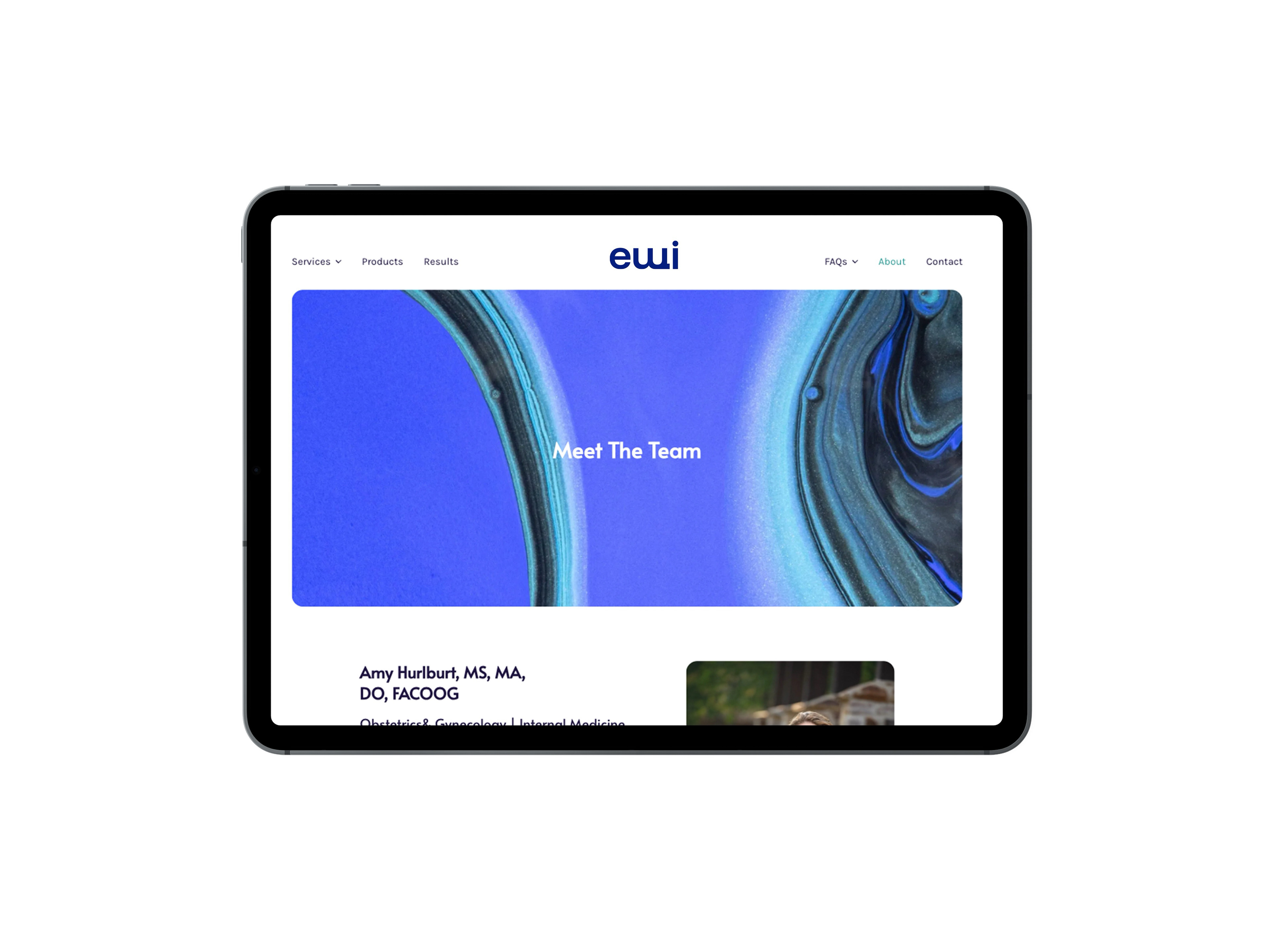
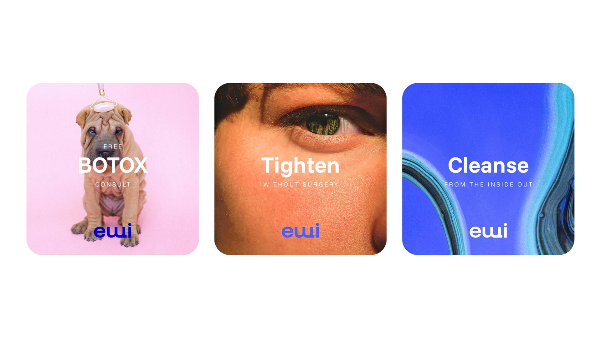
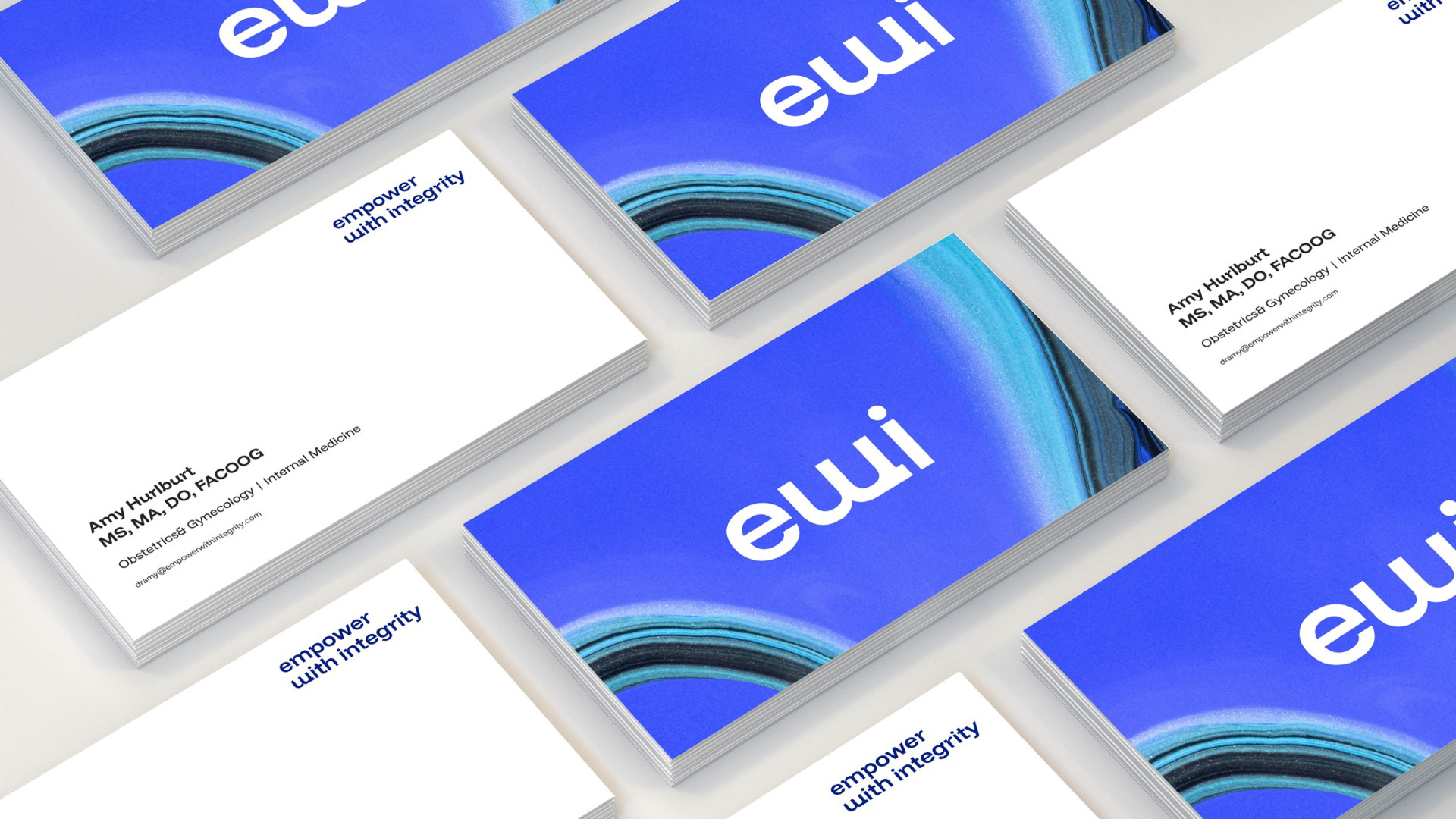
Brand identity for a modern clinic built on precision and subtlety, expressed through a clean, minimal logo defined by balanced typography, confident spacing, and refined simplicity that lets the results speak for themselves.