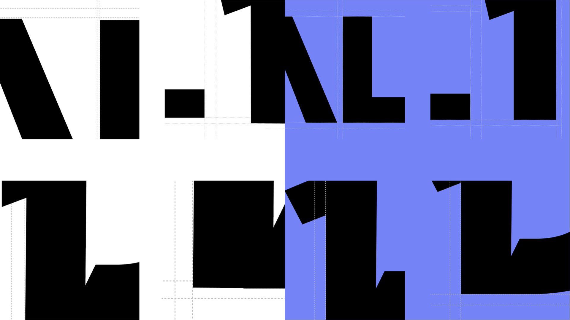
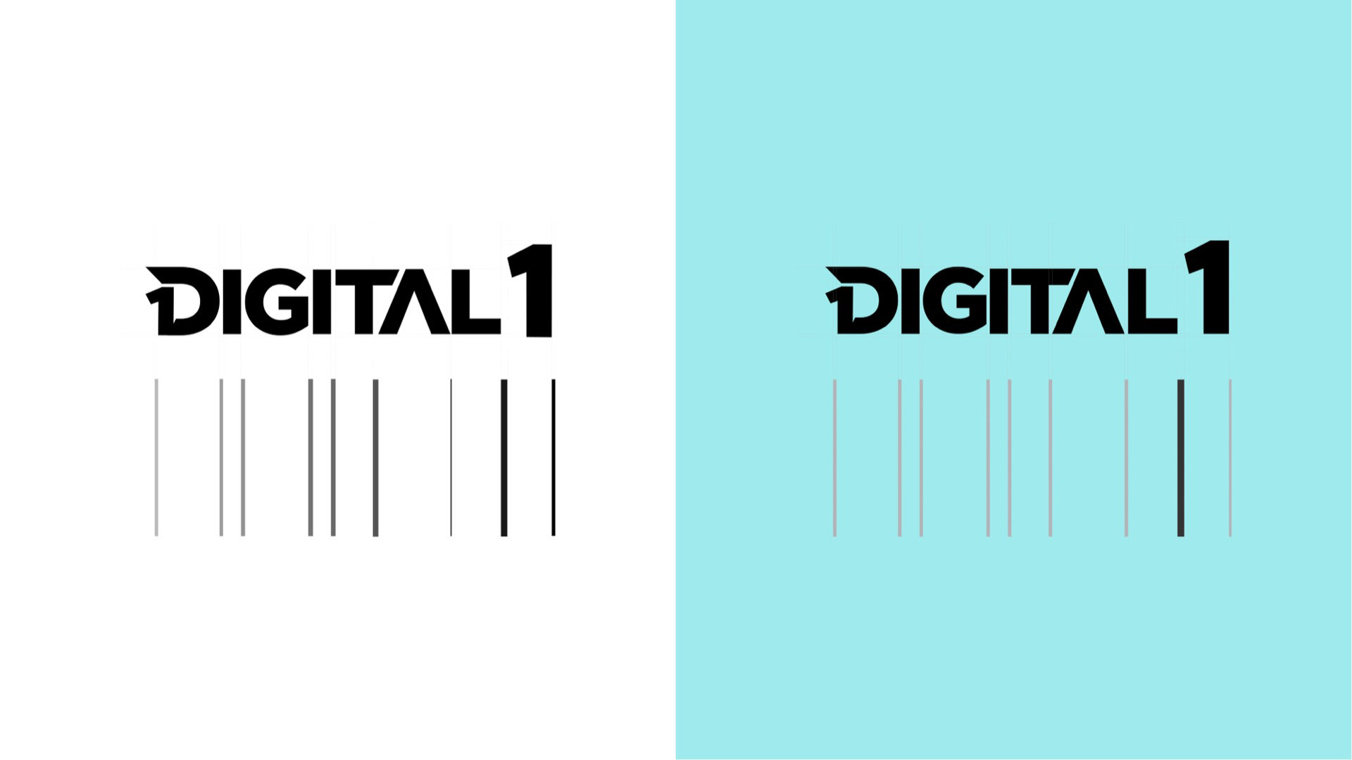
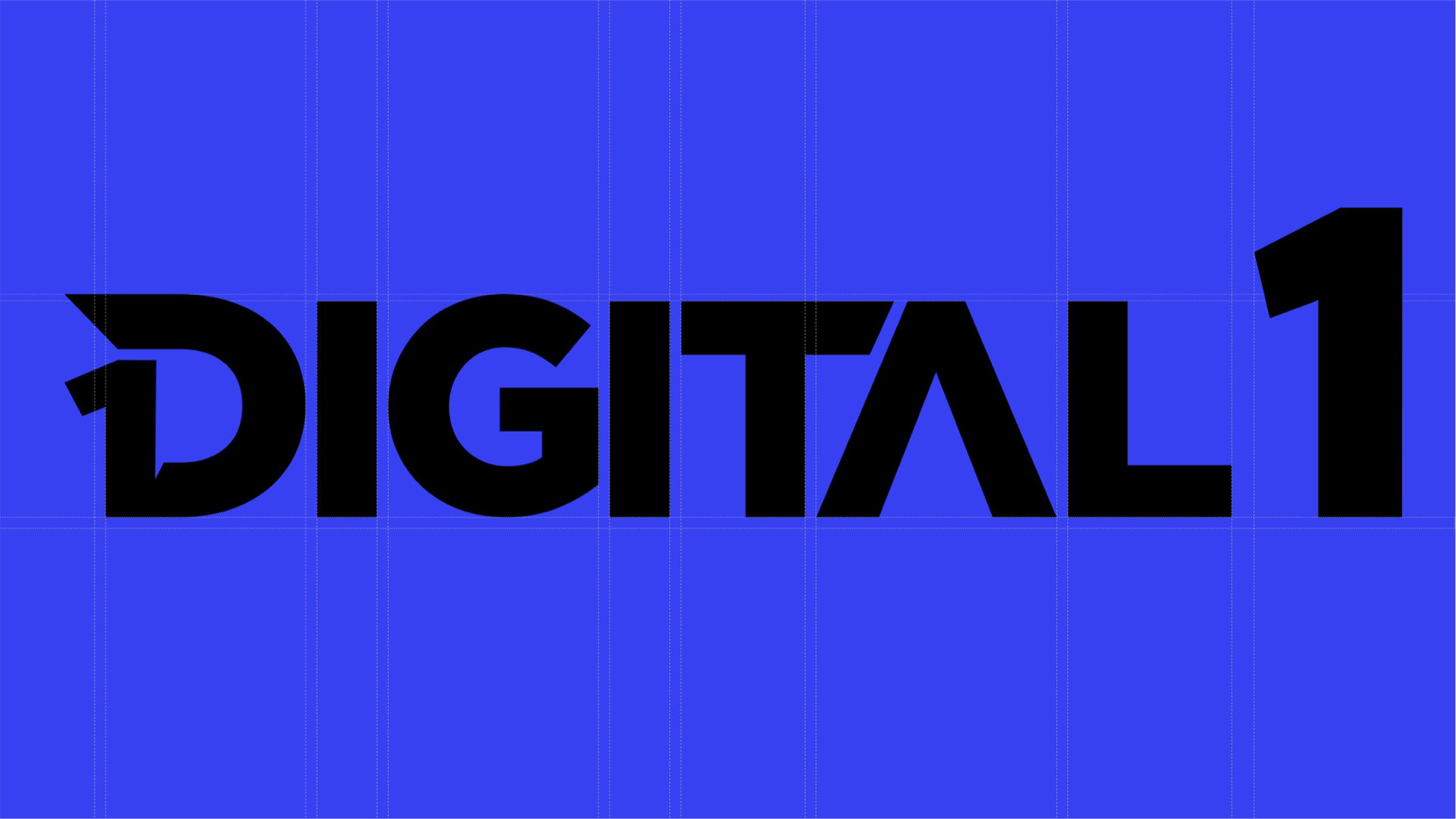
Refinement & Alignment
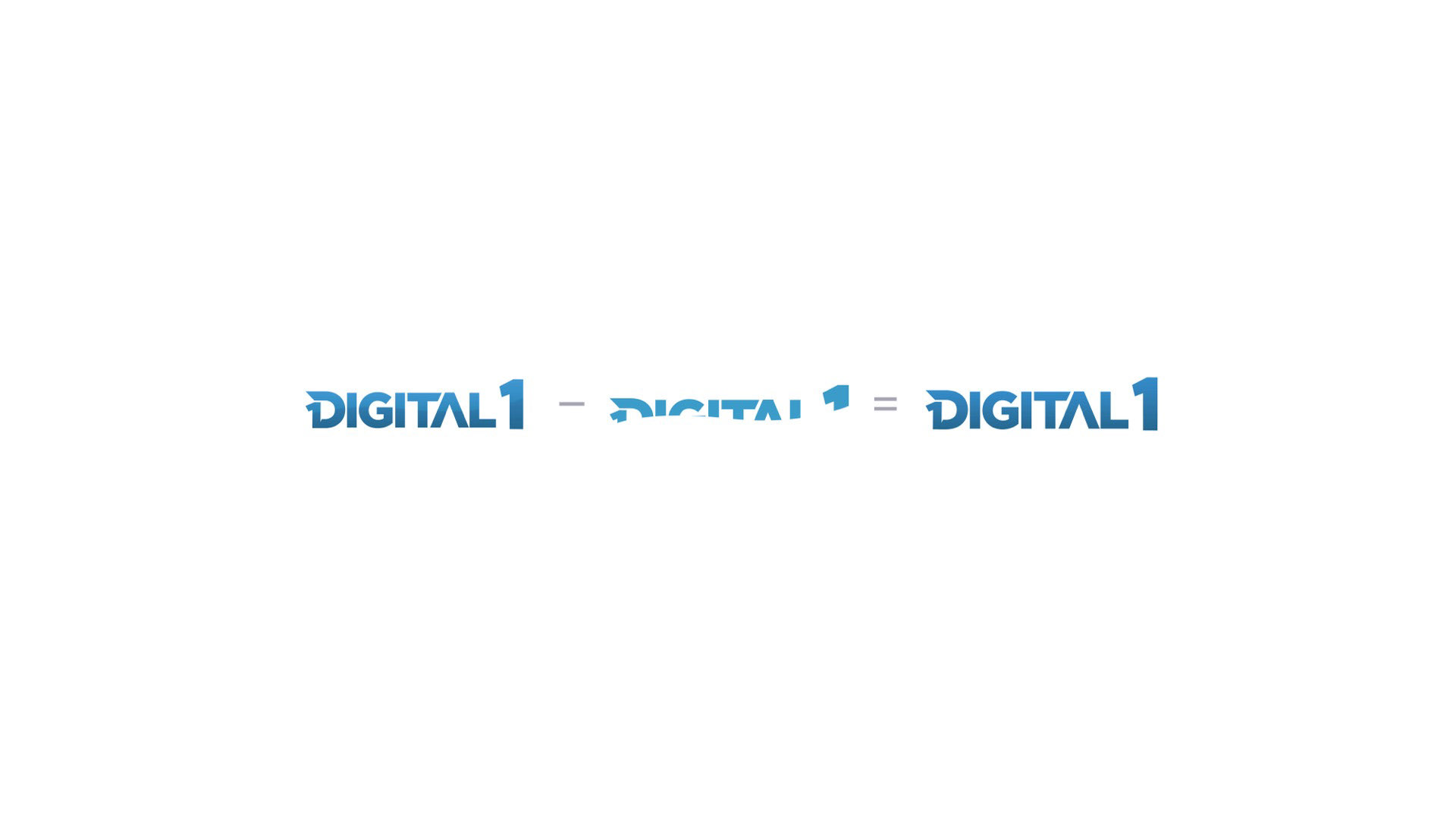
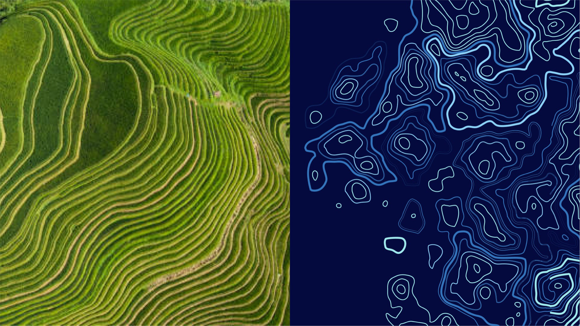
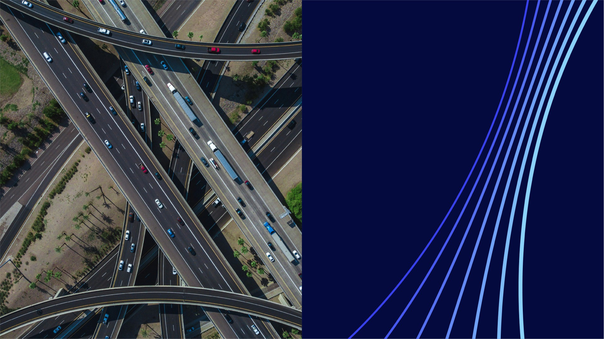
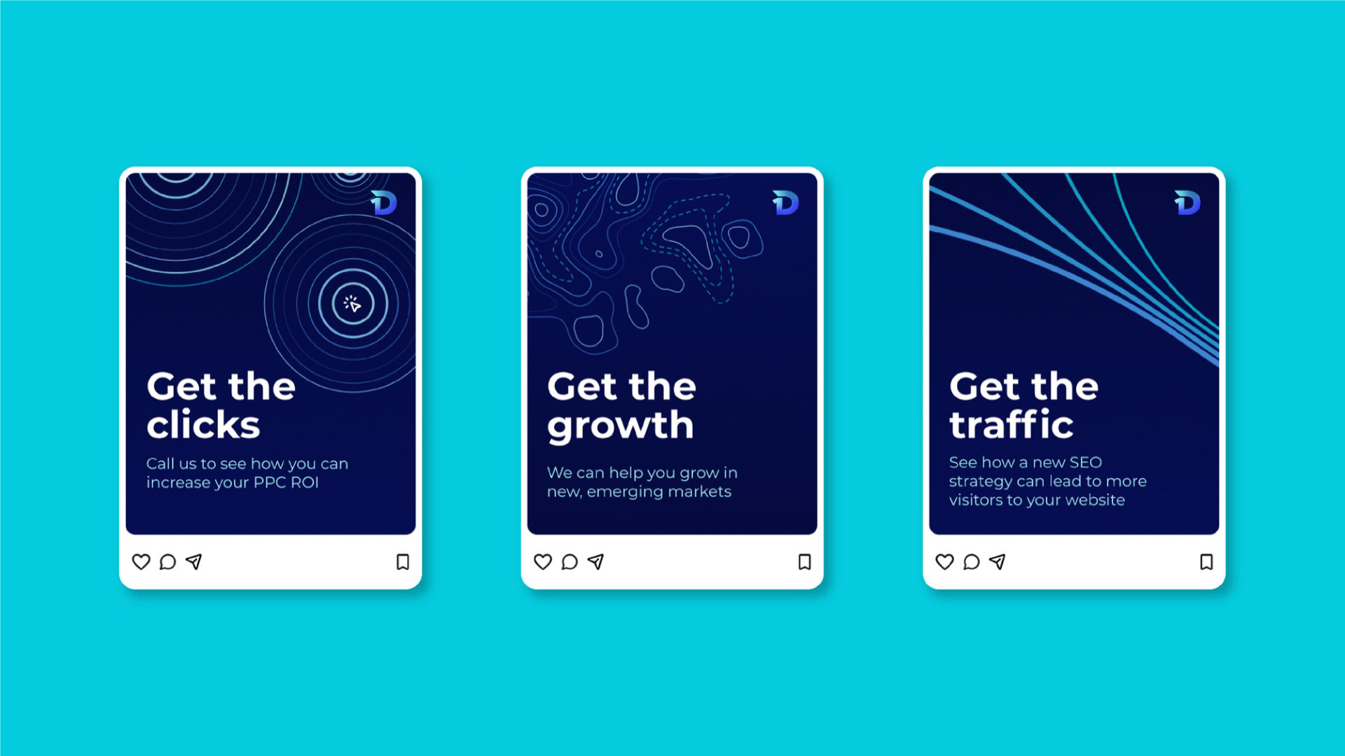
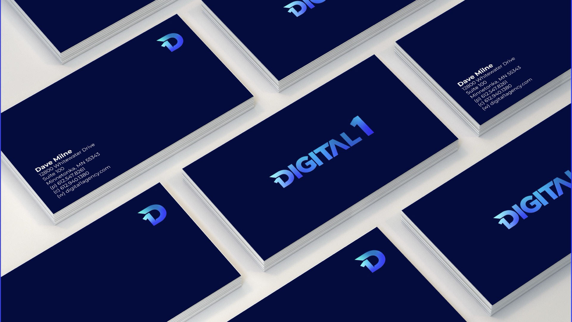
By removing unnecessary layers and refining the wordmark's alignment and letter spacing, the logo became a cleaner, more flexible mark. The color palette was also modernized — replacing dated gradient treatments with a system optimized for digital environments, giving the brand the visual impact needed to compete across screens and platforms.


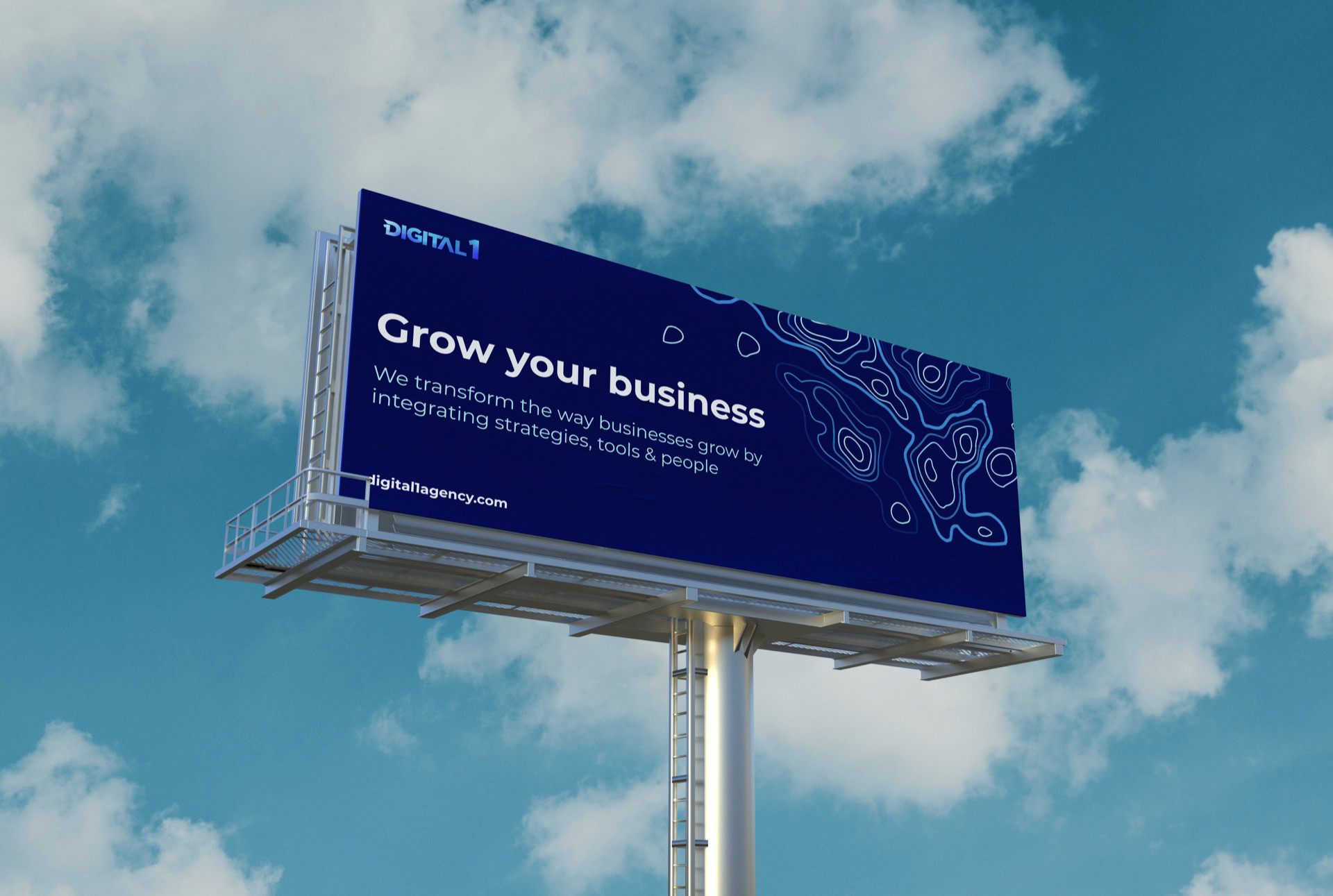

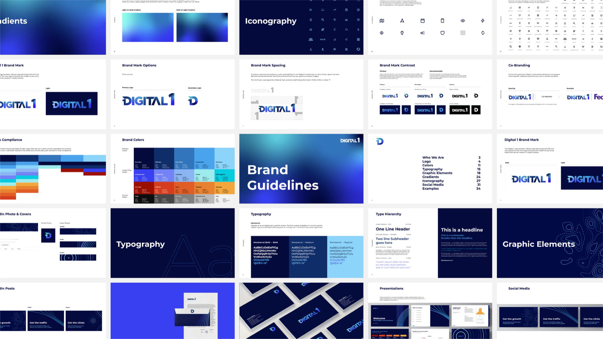


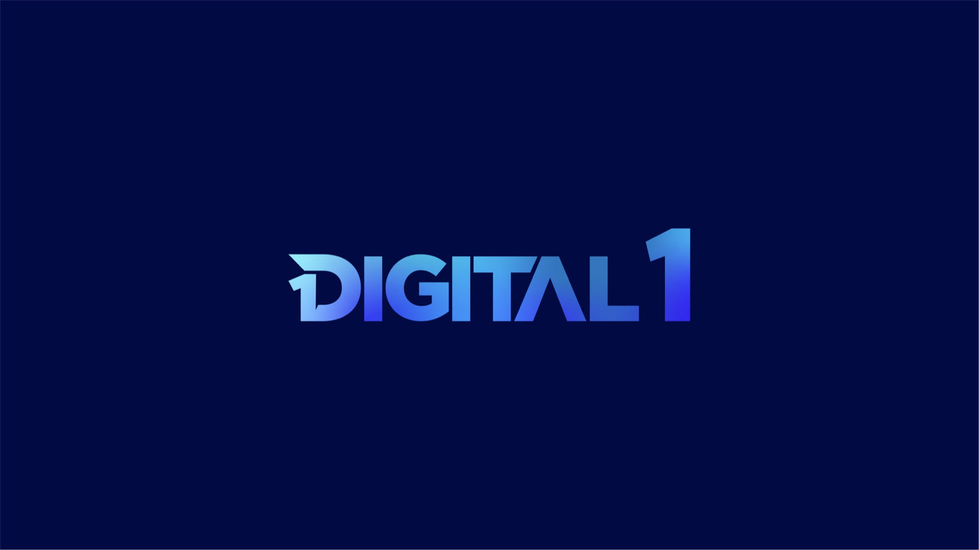
Impact
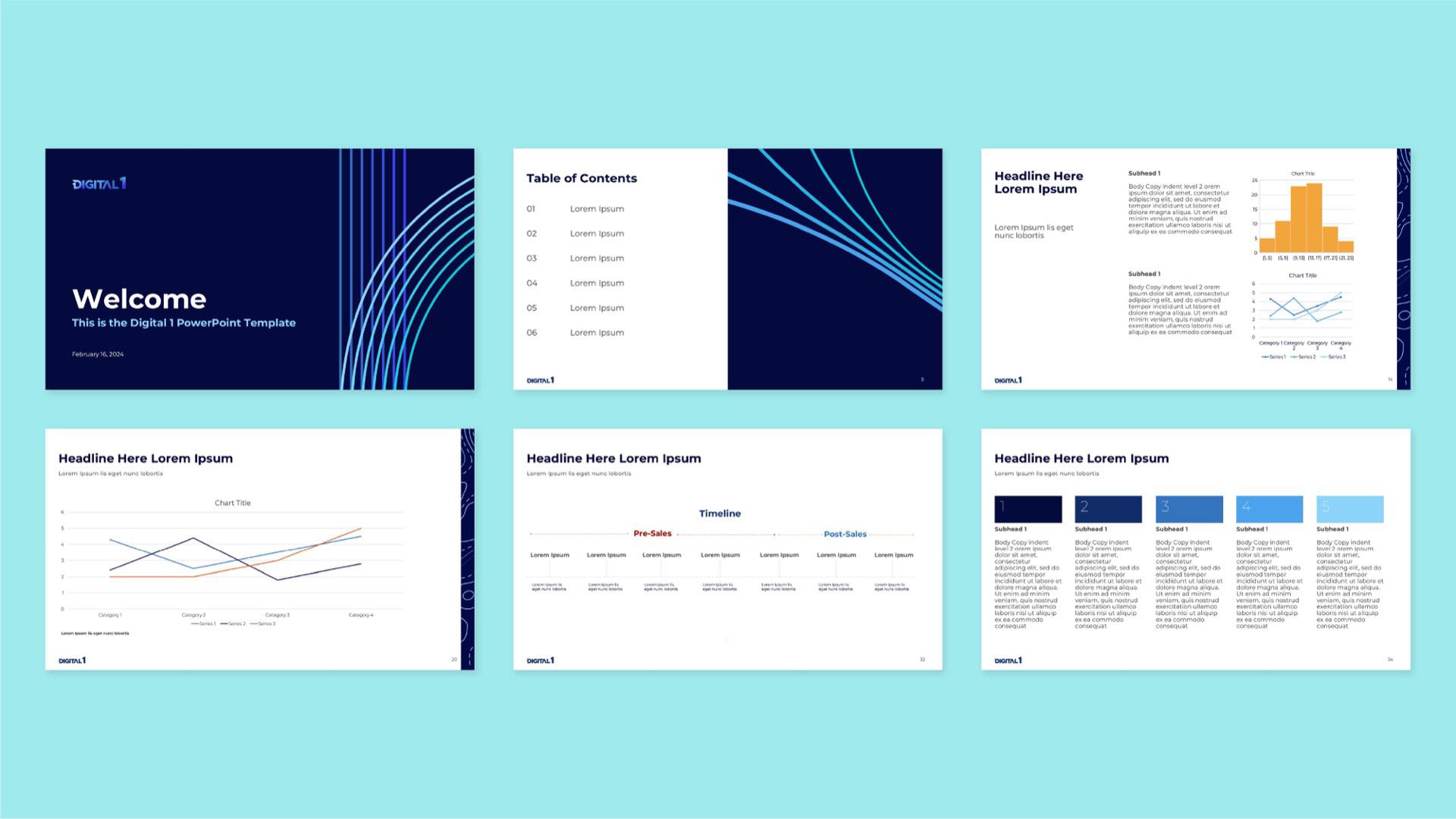
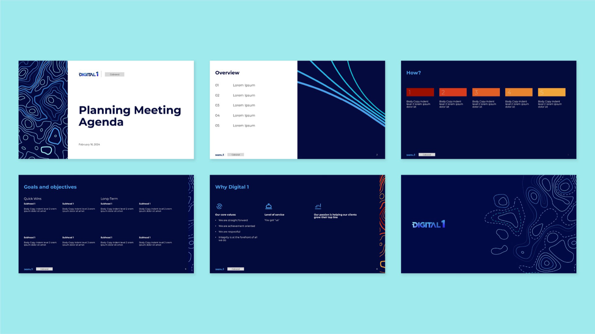
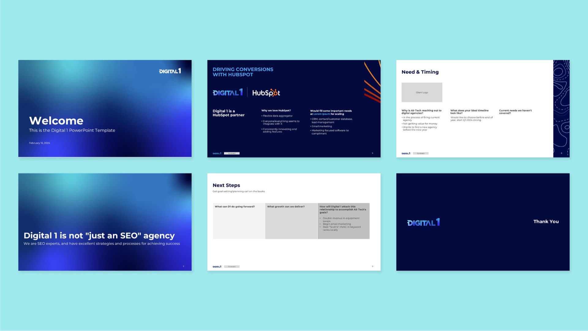
The rebrand repositioned Digital 1 with a clearer, more confident presence in the market. By evolving the logo, modernizing the color system, and introducing a cohesive set of graphic elements and icons, the brand gained the structure it needed to communicate consistently across digital touchpoints. What began as a presentation redesign ultimately became a scalable identity system — strengthening brand perception, improving clarity of services, and equipping the team with tools to grow with authority and cohesion.